HotActions 3.0 Tutorial
Prologue
Welcome prospective Users of HotActions 3.0! The file you handle occupies a certain space on the disk in order to become your guide book in the amusing front-end journey across the various dialog boxes and windows of this vital program. When you have gone through this, you will be able to easily create your first interactive projects to control 3D Virtual World.
Probably, some Chapters will appear too long to you to pass them in a burst of inspiration. It’s OK! No harm if you take a leave in the middle of a Chapter to relax for a couple of hours and return to the study later on (even if in a couple of weeks). The main thing is to note properly the halting point.
Before you start your journey, all equipment of the virtual studio must be tested and connected, the HotActions program (version 3.0!) and project samples are installed (including the accompanying media files), the cams are connected, and the keying is adjusted. If any of the above-listed “halts” (e.g. you see the word “keying” for the first time in life), contact Support or see Recommended Literature List.
Note, within this course you are not going to create 3D scenes from scratch (since this would be a separate story: see Appendix), but just learn how to create projects using the ready scenes (imported from 3D Studio MAX).
OK, I see you are all set – grab the mouse prettily and go ahead!!!
User Interface Overview
So, the application you are going to work closely in is HotActions (hereinafter referred to as ‘HA’). It is placed by default in the program group SnG Software\Focus\HotActions 3.0. OK, let’s start the program.
The program opens in Edit mode, whose name speaks for itself in no uncertain fashion.
To overcome the primeval fear of the unknown, let’s take a visual walk over the buttons and panes of still unknown function along the perimeter of the main application window.
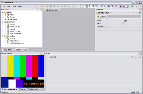
Let’s start our journey. Try to avoid clicking on unfamiliar buttons, especially X buttons in order to prevent a panic attack sorta «the window is lost!».
Toolbars
Let’s agree to refer to a row of command buttons with icons as a toolbar.
“Main Menu” Toolbar
Main menus – what they are for is as plain as the nose on this smiley.
“Main” Toolbar
In a graphic buttonlike way it duplicates the most popular commands included in the File and Edit submenus of the Main Menu. The command functions are obvious to anyone who opened a Windows program not for the first time in life, so we won’t itemize them (to spare space on this page).
“View” Toolbar
This toolbar contains the commands of the View submenu of the Main Menu used mainly to show/hide the panes docked along the perimeter of the main window:
At the end of the toolbar are commands used to adjust the view and layout of all panes at the same time:
![]() - Hide Docked Panes command to show/hide all docked panes at the same time.
- Hide Docked Panes command to show/hide all docked panes at the same time.
![]() - Switching between the three pane layouts.
- Switching between the three pane layouts.
“Tools” Toolbar
Duplicates the Tools submenu of the Main Menu and contains commands for switching the program modes and performing different adjustments, including video and audio:
![]() - Switching to Live Mode (when clicked, changes to Edit Mode);
- Switching to Live Mode (when clicked, changes to Edit Mode);
![]() - Start All command for project initialization (when performed, changes to Restart All);
- Start All command for project initialization (when performed, changes to Restart All);
![]() - Play/Continue Project Scenario;
- Play/Continue Project Scenario;
![]() - Show TV Output (displays Rendering output on the TV monitor);
- Show TV Output (displays Rendering output on the TV monitor);
![]() - Live Video Configure (selecting input video sources, adjusting keying, etc.);
- Live Video Configure (selecting input video sources, adjusting keying, etc.);
![]() - Options, the application general settings.
- Options, the application general settings.
Dockable Panes
New Items
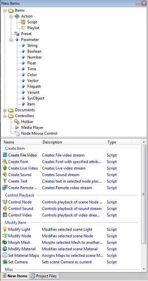
The upper part of the pane is a “factory” of various object types you can create in our projects. By dragging an item to the project window, you create its instance in your project.
The lower part of the pane is a “storage” of ready-made objects, in particular, ready-made actions. In what follows, you are going to use them actively.
Project Files
To open this pane, click on the appropriate button of the same name on the toolbar:
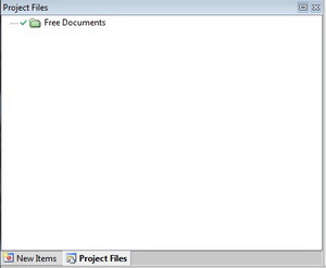
Here you can explore and edit the project file structure. Since no project is loaded as yet, no structure can be observed right now. Never mind, you are gonna make up for it later on.
Icons

The pane is an icons explorer you can use in the design of your buttons.
Explorer
File explorer in the classic Windows style. You can use it to open files of various types in our program by simply dragging them from the pane to the center of the main window (or just by double-clicking if the files are “native” to our application).
Editor
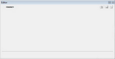
In strict accordance with its name, this pane is used exactly to edit objects created in the project, in particular, Actions and Presets.
Properties
Since you are going to use this pane continuously, do treat it with due care. It always displays the selected object properties (to be more precise, focused object properties).
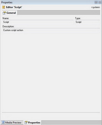
Object properties can be as follows:
- displayed in one or several tabs;
- editable or read-only;
- displayed as a dialog box or a parameter list with values.
As an example, select an icon in the Icons pane – and the properties pane instantly displays the corresponding information about it (in this case, non-editable, that is read-only information).
Render Preview
Perhaps, it’s the major pane in this application, since it provides a breakthrough to our 3D scene.
When there is no scene loaded, you see the default color-bar pattern in this window– the “Identity Parade” show so beloved by all TV men.
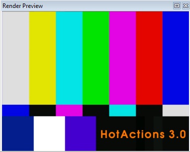
- Tips & Tricks! This static picture presents the graphics file EmptyRender.bmp located in the program subdirectory \Common\Images. So if you please, you can change this standard “lineup” for something done in-house…
You are going to examine the rest of the panes, Debug Output and Media Preview, still hidden for now, later on (their names already speak for themselves though).
Working with Panes
Any pane, if you like, can be easily expanded to full width by using the ![]() button in the right of the title bar. And not only! You can move a pane horizontally along the strip, re-dock it to other parts of the Main Window, or undock it to be in Floating mode. To do so, just drag it by the title bar to the location you want it – while you do so, the pane tries to stick to the right place (there is a knack to it to control the procedure, though).
button in the right of the title bar. And not only! You can move a pane horizontally along the strip, re-dock it to other parts of the Main Window, or undock it to be in Floating mode. To do so, just drag it by the title bar to the location you want it – while you do so, the pane tries to stick to the right place (there is a knack to it to control the procedure, though).
You can also join panes in a common tabbed panel by stacking them on top of each other. The order of the tabs in the panel can be changed by dragging.
Note that each pane has a context menu, opened by right-clicking on its title bar.
Context menu, as used hereinafter, refers to the pop-up menu that appears when you right-click on an object, title bar, or the free space in a window.
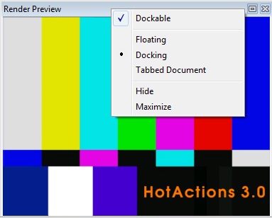
By using this menu, you can even move this pane to the document area in the center of the Main Window. To do so, select Tabbed Document from this menu.
If you closed a pane by clicking on the X, whether intentionally or accidentally, you can show it again by using View / <pane name> or by clicking on the appropriate button in the View toolbar.
So you can completely change the default view and layout of all panes to adapt them to your preferences.
In the not-so-distant future, having become an HA expert, you may probably want to use several pane layouts in Edit mode. There are provided as many as three layouts you can save in this case. When switching to a new layout, the previous one is automatically saved. You can switch layouts by using the hotkeys <Ctrl+1>, <Ctrl+2>, and <Ctrl+3>, or buttons ![]() on the View toolbar. By the way, any current layout can be reset to default by selecting View / Panes Layout / Reset to Default in the Main Menu.
on the View toolbar. By the way, any current layout can be reset to default by selecting View / Panes Layout / Reset to Default in the Main Menu.
Workspace
Once we mention the Layout feature, now you can learn how to save this information (and not only it) in a separate file. If you have an inquisitive mind, it will do you good.
There are Workspace files (.vsw extension) used to save this workspace. They save:
- above all – the current pane layouts (all the three of them) and the pane views: the way they are located in the Main Window, which of them are shown, and which are hidden;
- path to the project that was opened when you last closed the application;
- paths to the free documents (not included in the project), if they were opened when you last closed the application;
- file states in the object trees (expanded or collapsed);
- …other information that depends on the application version.
An application folder contains at least one such a workspace file loaded by default at start and automatically saved when you close the application (if in full HA version, it is referred to as Default_Full.vsw).
However, if you like, you can load and save the workspace to a separate file of your own, using the Main Menu File / Open Workspace… and File / Save Workspace As….This may be useful if several men work with HA under the same Windows user, and everyone labours at a project of one’s own and with one’s own layout as well.
If you want to exercise, first, still not moving the panes, save the workspace to a separate file by using the aforesaid save command. You may name the file in an “original” way, for example Original.vsw. Then, by dragging the panes by the title bars, go ahead and drive them from one place to another over the Main Window, hide them, undock them, etc., at intervals saving the workspace to separate files (e.g. Config1.vsw, Config2.vsw). Now, open them randomly and make sure the panes occupy the positions that correspond to the moment of saving. Finally, don’t forget to load Original.vsw to restore the original configuration! Just in case, note that when you close the application, the current configuration of the panes is saved in the register as well (in addition to saving in the default workspace file) – so, the “irretrievable loss” of Default_Full.vsw is not such irretrievably dreadful.
So, after you’ve kinda got a handle on the application’s major windows, you can go ahead and start on your First Project!
Loading and Managing a Ready Project
Before you start casting a project of your own, try to load a ready one and play with it to your heart’s content. Jumping the gun, we load the project that should be ready as a conclusion of our actions during the education process.
HotActions version 3.0 up projects have the .vs extension.
To load a project, you have as many as five ways:
1. Find the required project in the Windows explorer and double-click on it. The project opens in HotActions (even if the application is currently closed, it will start up).
2. Find the project using the built-in Explorer of this application (see pane description above) and double-click on it or drag to the client area of the Main Window.
3. Click on the Open ![]() button in the main toolbar: a standard open-file dialog box opens, where you can select the required project.
button in the main toolbar: a standard open-file dialog box opens, where you can select the required project.
4. Select File / Open… in the Main Menu.
5. …or just press <Ctrl+O>
So, select the way you like and load the project Project 14.vs The main application window will take the following form:
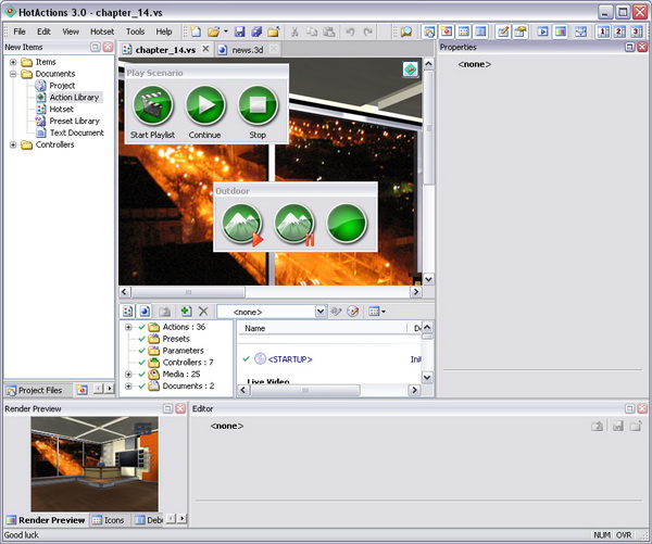
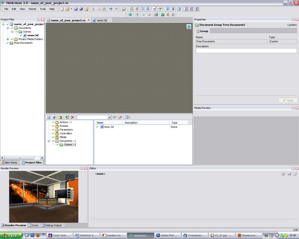
In the central part, you see the project window proper, and it reminds of the standard Windows explorer, as it presents the inseparable couple of the folder tree (left) and list of objects that are in the selected folder (right).
Straight above the project window title bar, you see the so-called hotset (if opened) that contains variegated scene-control button panels – hotbars.
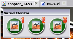
Hotset can be opened like a tab (whose gripper bears the same title as the project) in the application document area above the project window. Some project hotsets can contain, in turn, several subtabs or, in other words, pages.
Now, when the project is loaded, the Project Files pane displays all media files that are included in this project (at least, this is a 3D scene), as well as its own Media Files, that is paths to various media types that refer to this very project.
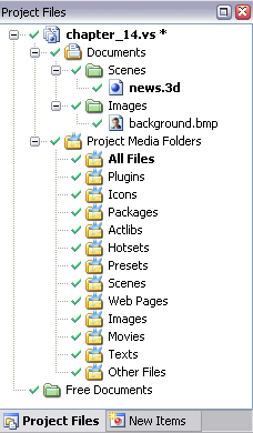
List of files for each media type is displayed in the Properties pane. Don’t be surprised if the lists are empty – then, the project finds the required files in its own folder and subfolders, or in the Common Media Folders of this application.
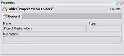
Common Media Files apply to all projects and the application in general. They can be specified in the application general settings. To do so, select in the Main Menu: Tools / Options… / Common Media Folders tab.
But what comes above all, the Render Preview pane now displays the 3D scene image, which currently may look somewhat strange (since the project is not initialized as yet). In particular, a “flat dummy” is displayed so far instead of the image from your connected camera – hereinafter referred to as “Actor” object.
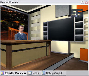
Now then, let’s start the project and try to control the 3D scene. To do so, switch the application to the second basic mode – Live Mode.
Live Mode
Live Mode is used to control the scene as much as possible effectively during studio recording session or during live broadcast, having close at hand wheresoever – maybe even in the armpit – just the necessary controls. Live Mode provides a somewhat higher system performance than Edit mode.
To switch to Live Mode, click on the Live Mode ![]() button in the Tools toolbar or use the Main Menu option Tools / Live Mode
button in the Tools toolbar or use the Main Menu option Tools / Live Mode
Click on the switch button, and the Main Window instantly changes its appearance: the working panes and the project window are hidden, and what’s in view is just the hotset with the control buttons and Render Preview.
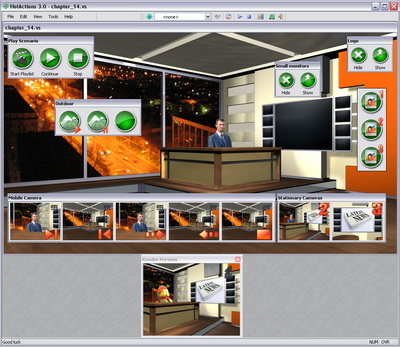
There are only the Main Menu and the Tools toolbar remained in the upper part of the window, – but even the latter changed its appearance:
The following buttons are changed/added:
![]() - Reverse switch to the Edit mode;
- Reverse switch to the Edit mode;
![]() - Combo box for selecting the current preset;
- Combo box for selecting the current preset;
![]() - Editing the selected preset;
- Editing the selected preset;
Pay special attention that automatic project initialization is performed immediately after switching to the Live Mode (meanwhile, an information message is displayed in the center of the window), and the full-screen image of the scene shows on the output TV monitor (the latter doesn’t apply to the program modification HotActions Design!).
After the initialization, some scene objects may change their positions, and some textures may change their appearance, a looped playback of some animation tracks and/or video files may be started. The most impressive change: live video from the connected camera appears instead of the Actor image (sure if it is properly connected and selected in the video settings dialog box (see the appropriate document in Recommended Literature List).
The hotset has taken the form of a floating window, whose size is fitted to the layout of the titled button panels. Go ahead and push the buttons trying to understand, while looking at Render Preview or the TV monitor, what scene changes this all causes… (Come on, what are you afraid of? This is no Doomsday Switch!)
If all of a sudden it seems like you’ve overdone it with the buttons and spoilt it all, – don’t worry and push the ![]() Restart All button on the Main Toolbar.
Restart All button on the Main Toolbar.
Restart All command executes the reset and re-initialization of the project. Its effect is equal to the consecutive execution of the Reset All and Start All commands.
While staying in the Live Mode, you can load other projects – e.g. using the Main Menu File / Open or the key combination <Ctrl+O>. The new project is automatically initialized immediately after it is opened (the latter applies to the Live Mode only!).
Recent projects can be opened using File / Recent Projects menu option or the drop-down menu on the right of the Open button on the main toolbar.
Do try to open and explore different projects included in your virtual studio package. By their functionality, interface, and scene control, these projects can differ much from each other, – and that’s normal. Therein lies your purpose – to learn how to create unique projects of your own.
Closing the Project
Now a couple of words about how to close projects. You cannot but notice that when opening a new project, the previous one is automatically closed. Nevertheless, the File menu contains a Close Project command. It can be used in order not to open the last project when you start the application – because you know: the application at closing saves the current project, and opens it automatically at the next startup.
- Actually, automatically load-last-project option is specified in the application general settings. To do so, select in the Main Menu: Tools / Options…, the General tab, Load last Workspace at startup option. When the check box is unchecked, HA always starts empty.
Presets
It would be difficult to overlook a new control, combo box, to be more exact, drop-down list in the changed toolbar Tools.
In a number of projects, this combo box is empty. So, load the project “Crown” and make sure the combo box now contains a list of so-called presets.
Every preset presents a set of different global parameter values of the project, their number and type depending on the goals and fantasies of its creator. The selection of another preset in the combo box changes the current parameter values and eventually changes the scene image and/or its control response.
For example, change the current preset “Color Scheme 1” to “Color Scheme 2” in the project “Crown” and restart the project by clicking Restart All (you can use the <Ctrl+R> hotkey). The scene changes its image from one to another.
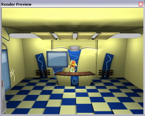
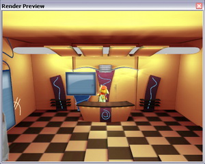
You can edit the parameter values of the current preset, if it is allowed by the project creator, by clicking Edit Selected Preset on the toolbar. A modal dialog box with the list of global parameters included in the current preset opens:
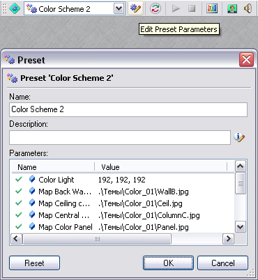
To change a parameter value, click on its field in the Value column. Depending on the parameter type, an edit control appears. It may be an open-file dialog box, color-selection or font-selection dialog box, integer or real number edit box, combo box, etc. Hope, using these controls is intuitive enough and does not present difficulties. When you have changed parameter values and closed the dialog using the OK button, don’t forget to click Restart All if you want to see the changes immediately.
If you’ve changed the values of parameters included in the preset, don’t be surprised that you are asked to save the project file changes when closing the project. At the slightest fear of spoiling anything, answer with a categorical “No”.
So, you have experimented with different projects. Now, with a feeling of duty done, leave the Live Mode. To do so, click on the Edit Mode button in the Tools toolbar in order to continue learning the HA basic entities. Next in turn – exploring a typical 3D scene document.
Getting Acquainted with 3D Scene
Load the ready project “Chapter_14” and look at the hotset tab title bar (or tab gripper, in other words). On the right of the active tab title “Chapter_14” (it bears the same title as the project itself), you will easily find still one – with the scene name: “News.3d”. This tab is inactive, so click on it to examine the structure of a typical 3D scene.
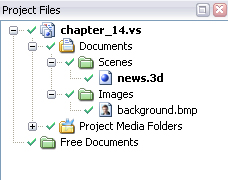
- You can also activate the project scene document by clicking on the Show Scene
 button in the project window toolbar or by double-clicking on the appropriate scene file in the Project Files pane tree.
The scene document is now displayed in the application document area, where the hotset tab has just been.
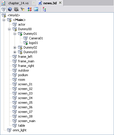
The document toolbar contains buttons used to display the trees and lists of the major types of the scene objects. These are:
Hope, the functions of these scene objects are intuitive enough to be easily understood, and still, let us specify them just in case:
- Polygon Mesh is a collection of faces and vertices that define the shape of a 3D object.
- Node is a virtual object used to determine the position (transformation) of a mesh, camera, or light in virtual space (position, rotation, scale), and also the object hierarchy in the scene. Not all nodes correspond to meshes: there are so-called “dummy” nodes used for auxiliary purposes.
Now let’s go over the most interesting points in each list.
Node Tree
By default, you see the tree of scene nodes that displays their hierarchy – “inheritance links”.
- If you like, it is possible to display all nodes in a linear list. To do so, uncheck the View as Tree option in the context menu opened by right-clicking on the free space in the window.
Let’s examine the tree nodes. If the Show Owned Items ![]() button on the toolbar is clicked, under each node you see the object this node refers to.
button on the toolbar is clicked, under each node you see the object this node refers to.
Some nodes have green or yellow arrows in the lower right corner of the icon. The green arrow ![]() means the node has its own animation track. Click on such a node, e.g.
means the node has its own animation track. Click on such a node, e.g. ![]() «Node00». Now its animation track can be played using the Player in the lower part of the scene document:
«Node00». Now its animation track can be played using the Player in the lower part of the scene document:
No animation in the Render Preview window when playing a node – it does not necessarily mean that something is wrong somewhere. Maybe this object is simply not in view of an active virtual camera.
The yellow arrow ![]() indicates this node has some child nodes that have their own animation – at list one child node with a green arrow.
indicates this node has some child nodes that have their own animation – at list one child node with a green arrow.
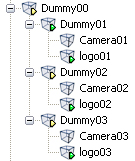
Such yellow-arrowed parent nodes can be played as well, in which case all the child nodes that have their own tracks will be played.
If a node has both its own track and child node tracks, all these nodes are played when the parent node is played.
The nodes that do not have arrows at all, cannot be played (nothing to play!) – so don’t be surprised that the player controls are grayed out when such a node is selected:
Pay attention to the Play Position (current frame position) display ![]() in the right of the player.
in the right of the player.
By default, the current play position is in SMPTE format, that is HOUR:MINUTE:SECOND:FRAME. But if you like, you can change this format using the context menu opened by right-clicking (e.g. you are more used to measuring time in frames).

The current position value can be copied to the clipboard when necessary. To do so, select the value and use the <Ctrl+C> key combination.
You can notice that a node in the scene tree may be in bold type. That ![]() means this node is active (or current).
means this node is active (or current).
If you move the mouse pointer in the Render Preview window while holding the left mouse button, the active node transforms according to the pointer movement (by default – rotate). To make a node active, double-click on it in the node tree (list).
You can shift the active node while holding the <Shift> key, and scale it while holding the <Ctrl> key. Change the transformation axes by using the <Tab> key, the axes switching cyclically with each pressing (e.g. ХУ-УZ-ZX-XY, etc.).
To return to the original node position (reset transformation), press <Ctrl-R> while staying in the Render Preview window (all nodes resetting), or using the Reset option in the node context menu (this specific node resetting).
All this is used to examine the scene objects in detail and also to fit the transformation numerical values. For example, make the node “Node01” active and turn it with the mouse as described above. Now, examine the Node tab in the Properties pane. You will see there the changed transformation values, which can be copied to the clipboard when necessary.
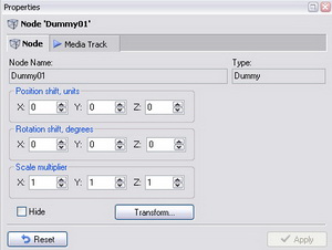
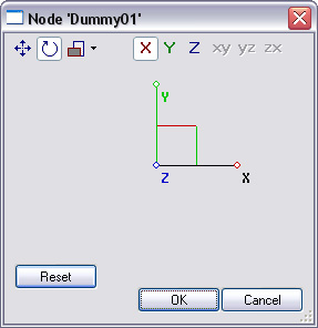
Note the ![]() button in the node properties – clicking on it opens a dialog box that provides an alternative way to change the node. Try to master it on your own.
button in the node properties – clicking on it opens a dialog box that provides an alternative way to change the node. Try to master it on your own.
Note that changing of any scene objects performed in the Properties pane cannot be saved in the scene file. The fact of the matter is that all scenes in HA are opened read-only, so it’s no wonder the Main Menu option File / Save is always unavailable (grayed out) for scenes. The ability to change the properties of scene objects is used rather to explore its arrangement and to fit exact numerical values in order to use them as action parameters (all this will be described in detail later on!).
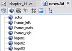
List of Meshes
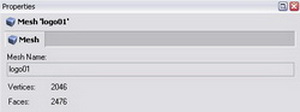
This list is for purely information purposes: displays the list of all meshes in alphabetical order. When selecting a mesh, the Properties pane displays the number or its vertices and faces.
List of Cameras
If cameras in the scene are more than one, one of them is always in bold in this list, – that is active. The Render Preview window always displays the view from this very camera which is currently active.

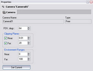
As well as a node, a camera can be activated by double-clicking on it in the list of cameras in the scene document.
If you click on the Preview Render pane and roll the scroll wheel, you change the active camera’s field of view.
List of Lights
Allows to understand how many light sources are in the scene and of what type they are. By the way, don’t be surprised if there are none in some scenes – that means, self-luminous materials are used there.

List of Materials
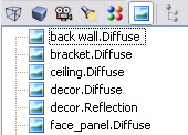
Have a look at the list icons to understand which materials have texture maps, and which do not:
![]() - material with one or more maps;
- material with one or more maps;
If the Show Owned Items option is on, the used texture maps are displayed under each textured material as first-level child nodes.
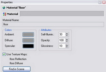
List of Maps
Here you see a list of texture maps that belong to the current scene (packed into its .3d file). In what follows, you will learn how to change any map from this list to another image file.
The map name consists of the material name to which the map is assigned, and the map type (separated by a dot).
The properties of a specific map display information about its size and other attributes.
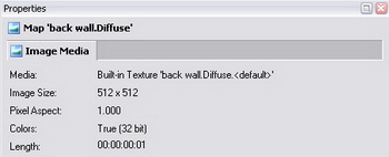
Now, while staying in the list of maps, activate the Media Preview pane that has been previously hidden. To do so, use the Main Menu View / Media Preview or just click the ![]() button in the View toolbar.
button in the View toolbar.
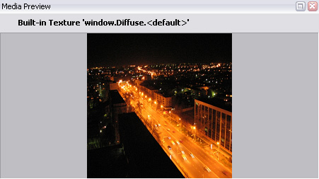
This pane displays a 2D image of the map that was selected in the list of maps. It may be useful when looking for a specific texture in the scene.
Now you are familiar with a typical scene document… Congratulations! You do possess all necessary knowledge to get down to creating your First project in real earnest!
Creating New Project
Selecting Project Location and Basic 3D Scene
Here goes. Select File / New in the Main Menu or click on the first button in the Main Toolbar.
The following dialog box opens:
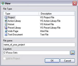
Select Project in the File Type list, and specify the name of the prospective project in the File name field (e.g. “Project 02” – neat but not gaudy).
In the Location field, specify the path to the folder that will contain the new project and its files. Click OK. New Project Wizard opens.
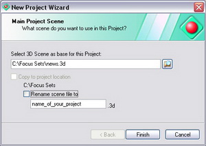
This wizard prompts you to assign a basic 3D scene for the prospective project, and you do so by selecting your beloved “News.3d” from the files attached to this course.
Here you are also prompted to copy the scene to the prospective project folder and to assign to it the project name. Why not? Let them all be in the same location.
If you have not selected the Copy to project location option – never mind! The scene pathname is saved in the media files of this project (it’s displayed in the Properties pane, if you select Project Media Folders / Scenes in the Project Files pane).
Close the wizard and feast your eyes upon what has been done. However, there is nothing special to be proud of as yet – the project is virgin-blank!.
Actions and Project Initialization
Before you proceed to adding meat to the skeleton, we are going to explain the gist of the action objects named in this “cinematographic” way.
Actions are the smallest bits of the scene properties and scene behavior, the nuts and bolts of each project. The body of an action is a command sequence of a special script. When playing (or executing) an action, these commands are executed causing various changes in the scene. The result of it may be switching cameras, playing animation, assigning textures, moving objects, playing other actions, etc.
Don’t be afraid though: the fact that actions are based on the command script doesn’t mean you will have to program in it (which was the case in previous HA versions). For you, actions are just some “playable objects” with a set of variables. (There is special documentation for those who want yet to steep in script).
Let’s examine the contents of the “Action” folder in the project tree. Click on it not to put it to the back burner.
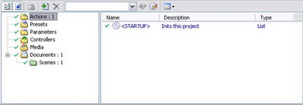
The right-hand list of the folder objects contains the only automatically created action –<STARTUP>. Its function is to initialize the project, that is, to set the scene to an initial working condition. For example, to assign an active virtual camera and live video, to change some textures, to hide or shift some nodes, etc. Let’s agree to refer to this special action hereinafter as simply “Startup action” (in order to further develop the Queen’s English).
The Startup action is automatically played:
1. when switching from Edit mode to Live Mode;
2. immediately when the project is opened if the application is currently in Live Mode;
3. by the commands Start All or Restart All.
You cannot rename or delete the Startup action, since this is a system action that doesn’t yield to the “encroachments” like these.
This action is of the List type (that is playlist). The actions of this type are used to play other actions and we’ll examine them in detail in a dedicated Chapter. Meanwhile, to get acquainted, open this action in the Editor pane. To do so, click the Edit Startup Action ![]() button on the project document toolbar.
button on the project document toolbar.
You see, the Startup-action playlist is empty – that means, no scene-init actions will be performed.

Let’s start gradually filling this Startup list with the first init actions!
Assigning a Video Stream to a Material
Let’s start from the most important thing – assigning a video stream from the real camera to the Actor, who plays the leading role in our scene: of the TV anchorman. Video from the real camera is hereinafter referred to as simply live video.
First of all make sure you know the name of the scene material used on the Actor object. Presumably, the name is known to the designer who had created the scene. But what if they are not close at hand – what to do? Calm down and take a sober view of things: think logically. There are as many as three ways to identify material.
1. Material Identification in Render Preview Window
This way is good when you know how the material in question looks, and it is seen well in the Render Preview window. Our Actor is also seen perfectly well from any camera. So, hover the mouse pointer over the Actor body and watch… No, not his reaction to the pointer! You watch what the application status line – main window bottom bar – displays. It displays: <World>.<Main>.actor (video_01).
The word in parentheses – video_01 – is the name of the material our anchorman is made of. And the preceding string of words separated by dots – the node names in hierarchical order: from the topmost parent node to the bottommost child node that belongs to the Actor. In what follows, this knowledge is going to come in handy to you when looking for a required node.
This method does not work if the image of the object under identification is overlapped by a transparent object. If this is the case, the status line displays information about this transparent object since it is closer to you, even though, it seems that the mouse pointer is placed on the required material. In this case, use the methods described below.
2. Material Identification in List of Nodes
You can quickly find the material name if you know its node name. This way is good when you simply have no idea how the required material looks, or the object is not seen in Render Preview.
You can see the required material name in the tree of Nodes if you switch on the mode Show Owned Items ![]() and completely expand the tree branch of the required node.
and completely expand the tree branch of the required node.
In this case, find and expand the “actor” node. A level below you see the corresponding mesh name (always matches the node name), still below – the required material name “video_01”. Still below you see the names of the texture maps that are used in this material.
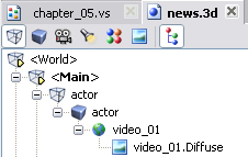
- If you cannot find the required node in the tree, even knowing its name (e.g. it’s “buried” in the lower levels of the tree), switch off the View as Tree option in the context menu of the window (the menu is opened by right-clicking on the free space in the window). Now all the scene nodes line up on the same level, as a list.
3. Material Identification in List of Materials
Well then, in the end let’s examine the case when you cannot see the required material in the Render Preview window (it being overlapped) and do not know the exact name of the corresponding node as well (or cannot find it among other nodes for some reason). In this case, the required material texture is going to help you even if you only have a slight idea about it.
Activate the list of Maps in the scene document and make sure the Media Preview pane is shown in the application. If not, use the Main Menu or View toolbar to show it. In this pane, examine the images of the supposed texture maps by successively clicking on them in the list of scene maps (or navigating over them by using the arrow keys). Having found an appropriate, by its look, map, examine it. Note that the first part of a map name (before the dot) – is the name of the material that uses the map.
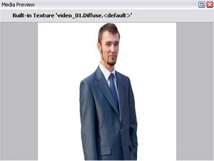
In this case, the Actor map name is « video_01.Diffuse» – that is, the required material name is simply « video_01».
So, after a long or short while, but the Actor material will surely be identified!
Using Standard Actions
Now, that you know the material name, proceed to the action “factory” in the New Items pane: click Items / Action / Script – and a “secret depot” of standard actions immediately opens in the lower part of the pane.
These actions are of the script type and they are referred to as standard since they present ready parameterized sets of action commands for managing the scene. They are applicable in various situations.
For future experts: the project file with standard actions named StandardSet_0419.vs is in the application subfolder Common. Actually, you can add your own parametric actions to this project (however, this would be already outside the boundaries of this course).
Well, your purpose, as stated before, is: to create and assign a live video stream to the Actor material.
So, find “Create Live Video” in the list of standard actions and drag it to any part of the project window: to a free area of the folder tree or to the open list of project actions (to the lonely blue Startup action).
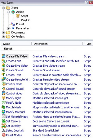
As the first sign of success – the Set up New Action wizard opens:
On the first page, select the live video stream you want to assign to the Actor material. If there is only one real camera connected, it is logical to select Live 1, which corresponds to LIVE_1 identifier in the video settings dialog box (for names and settings of the input video streams see en_vs_video_v3.01.doc).
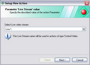
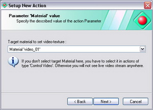
Click Next to proceed to the next page, where you have to select in the combo box a material to assign to the video.
Someone would panic here – but you! Since you have just found out the Actor material name, and you can select «video_01» with confidence.
On the last page of this wizard, you are prompted to enter a name for the new action – but the default name «Create Live Video» - suits you fine.
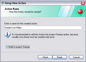
But do not hurry to close the dialog box and pay attention to the check-box option «Add to project Startup».
Here you check the check box since you would like to see live video on the dummy-Actor material immediately after the project initialization (in the course of which, you know, all actions added to the Startup-action playlist are played).
Close the wizard and look at the project window – a new action «Create Live Video» is displayed here:
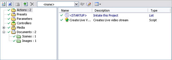
What is more, this action is added to the Startup-action playlist. If the latter is open in the Editor, you will notice that at once.

Click on the created action in the project list and examine its parameters in the Properties window. They are quite a few – do not change them in this stage and content yourself with the defaults.
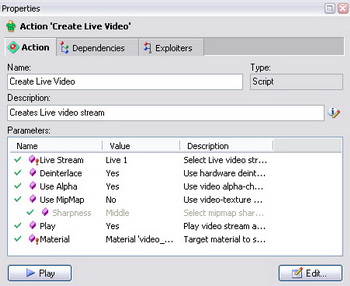
Test what you have done so far. Press Start All ![]() on the Main Toolbar to start playing the Startup action, to which your action (that assigns a video stream) added. There you are! Instead of the “frozen” Actor, your Charismatic Face appears in the virtual space of the scene! (Sure, if the connected camera looks at your good self…)
on the Main Toolbar to start playing the Startup action, to which your action (that assigns a video stream) added. There you are! Instead of the “frozen” Actor, your Charismatic Face appears in the virtual space of the scene! (Sure, if the connected camera looks at your good self…)
Setting Virtual Cameras
Elated by success, grab your mouse prettily and go on manufacturing these basic elements required for the scene control. In this Chapter, you are going to create actions for switching cameras and the first control buttons – kill two birds with one stone…
Simultaneously Creating Actions and Buttons
Return to the familiar action depot (New Items pane) and find there the standard action «Set Camera» ![]() (in the «Modify Item» group). Drag it and drop in the window… No, not in the project window! This time you do something different and drag the action directly to the hotset (just make sure it is active).
(in the «Modify Item» group). Drag it and drop in the window… No, not in the project window! This time you do something different and drag the action directly to the hotset (just make sure it is active).
If for some reason, the hotset is hidden, you can activate it by clicking on the Show Hotset button ![]() in the project window toolbar:
in the project window toolbar:
By dragging an action to the hotset, you give the application to understand that you are going to create a new button panel – or hotbar, in HA terminology. Button panel is a type of controllers.
Controller, as used hereinafter, refers to a window element located on the hotset and providing interactive interface for handling the scene or project elements.
So, when dragging the action to the hotset, the familiar Set up New Action wizard opens prompting on its first page to select a prospective virtual camera. Select «Camera01» and move on.
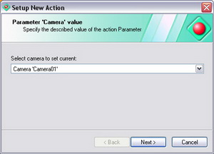
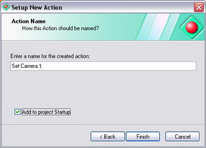
On the next page, change the prompt action name to a more specific «Set Camera 1». Similarly to the previous Chapter, check the Add to project Startup check box since you would like this camera to be active immediately after the project initialization, that is, by default.
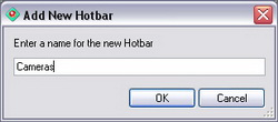
When closing the wizard, a small dialog box Add New Hotbar pops up prompting you to enter a name for the new hotbar. Without thinking twice, name it «Cameras».
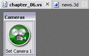
Now, you can rejoice at your progress: firstly, the new action «Set Camera 1» is now displayed in the project window (and added to the Startup action playlist), and secondly, the new button panel «Cameras» is now on the hotset. It contains so far just one button (of the same name as the action). But vanquish the temptation to click on it – you have to create still a couple of buttons.
Again, drag the standard action «Set Camera» from the New Items pane, but this time not to a free area in the hotset but directly to the “Cameras” hotbar. When you hover the mouse pointer over the hotbar, the insertion marker appears prompting the location for the new button. In this specific case, place the marker on the right of the ready button.
If you accidentally place the button in the wrong position in the hotbar, never mind: you can change its position any moment by simply dragging it when in the hotset Edit Mode.
As is your habit now, pass through the wizard dialog box, selecting «Camera 02» in the list of cameras, and then, changing the action name to «Set Camera 2». There you are – there is a new action in the project window, and a new button in the “Cameras” hotbar.
When creating the action, do not check Add to project Startup, since the «Set Camera 1» action had already been added to the Startup playlist. The logic is plain and simple: after the project initialization, only one virtual camera may be active. In theory, you can add to Startup as many virtual-camera-activation-actions as you want – but the last in the list wins).
To consolidate the knowledge, pass through this unsophisticated procedure once again – create the action and activation button for camera 3: «Set Camera 3» (without adding it to the Startup action as well).
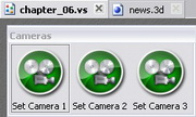
Save the project in any way soever: by clicking on the Save ![]() button in the Main Toolbar, or using the Main Menu File / Save, or by pressing <Ctrl-S> on the keyboard. Make your preferences.
button in the Main Toolbar, or using the Main Menu File / Save, or by pressing <Ctrl-S> on the keyboard. Make your preferences.
Now it is high time you checked the system of setting your virtual cameras – and you can do it even without switching to the application Live Mode.
Hotset Test Mode
To on-the-fly check the buttons without switching to the global Live Mode, you can switch the hotset to so-called Test Mode by clicking on the button ![]() of the same name in its upper right corner.
of the same name in its upper right corner.
So you do. The hotset grid has disappeared, the hotset itself expanded at the expense of the project window collapse, and the buttons now respond to the hovering mouse pointer.
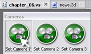
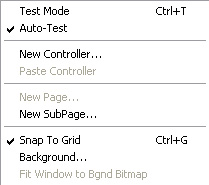
If the Auto-Test option is checked in the hotset context menu, the hotset is automatically switched to the test mode when executing the command Start All, and returns to the Edit mode by the Reset All command. (This option is checked by default).
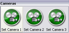
Go ahead now: you can randomly push the camera setting buttons and heartily rejoice at the diverse views of your virtual studio in the Render Preview window:
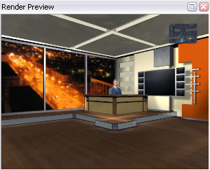
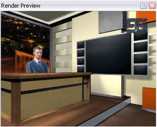
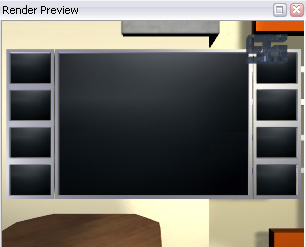
Exit the test mode the same way as entered – by using the button in the upper right corner, which changed to Edit Mode ![]() . If the test mode was switched on automatically (by the Start All command), this time symmetrically click on the Reset All button in the Tools toolbar.
. If the test mode was switched on automatically (by the Start All command), this time symmetrically click on the Reset All button in the Tools toolbar.
Changing the Visibility and Position of Nodes
Suppose, when examining the studio general view from camera 1, your good self all of a sudden wanted to hide the logo in the upper left corner of the frame, since it evidently steals the scene. Why not, make your wish come true!
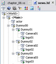
Before creating the logotype hiding action let’s take a look on the scenes tree of nodes carefully. It’s easy to notice that there are 3 nodes for logotypes – by one node for each virtual camera.
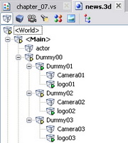
It means that to make it solid, we would have to hide all 3. Otherwise we are in a huge risk of having a situation on virtual cameras switching when logotype suddenly appears shouting: “Here I am, logo #2!”. Using the property of inherited showing-hiding of nodes we may avoid creating separate actions for each logotype.
- For simultaneous show/hide of several nodes having common ancestor it is enough to hide/show the ancestor node only. Still you need to be sure that it has no other child nodes that should not be hided.
In this example the lowest ancestor node for all logotypes (and all cameras also) is “Dummy00” node. To clarify your possible concerns that hiding this node will result in hiding not only all logotypes, but all virtual cameras too, we must say that virtual cameras cannot be hidden, because they don’t have specific visual representation (mesh) in the Render window.
Creating a Node-Hiding Action
Find «Modify Node» action in the group of standard actions «Modify Item» and drag it to the hotset.

In the Set up New Action wizard, select the Node ‘Dummy00’ option, since it is the very node that you are going to hide in your new action:
On the next (and last) page, name the action as «Hide Logo». Though it looks slightly strange – meaning we are hiding the cameras node – but the «Hide Logo» name reflects the action’s function much more precise. It is for you to decide whether or not to check the checkbox of adding this action to the Startup of the project. If you want the logotype being hided by default, mark the checkbox.
In response to the final prompt to name the new hotbar, enter the name «Logo».
There you are, there is now a new action in the project, and a new button in the hotset – on a separate hotbar. However, it is still early to check its availability – since you have not been asked in the wizard what exactly you wanted to do with the logo (and you do want to hide it!). This time, set the wanted parameters in the action properties.
You can quickly find the properties of the action assigned to the button if you do as follows: select the hotbar button (a thin focus frame will appear around the button), then select the Action tab in the Properties tab. The hotset test mode must be switched off, or otherwise the button will be just clicked and execute the action – and no properties you will watch.
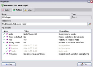
Now, select the Hide parameter in the action parameters list and hover the mouse pointer over the appropriate field in the Value column. Select “Yes” in the combo box.

However, even after clicking the Apply button, the logo does not rush to hide. No wonder: what you edited is not directly the node properties, but the parameter of the action that changes the properties.
- If an action is used to change the properties of an object, the properties will only change when playing this action (that is indirectly). Do not confuse it with directly changing object properties that are applied immediately after clicking Apply in the properties pane (as if you selected the “Logo” node in the list of scene nodes and checked Hide in its properties).
Now, play the «Hide Logo» action – and the logo immediately becomes a virtual astral body (that is, disappears from view). Sure, if exactly your camera 1 is active, since there are as many as three logos in the scene, one’s own logo for each camera.
By the way, you can play action not only by clicking on the hotset button when in Live Mode, but also in other ways:
- by clicking on the Play button in the bottom of the action properties tab;
- by selecting the Play option in the action context menu;
- by double-clicking on the action in the project list;
- by using the hotkey if it had been assigned to the hotbar button (assigning hotkeys is discussed in the dedicated Chapter below)
Want to return your logo back? Just do not break your eyelock with the Render Preview! There you are: your eyes have turned red, your heart aches with effort – the logo just does not want to appear again… Well then, there is nothing for it but to recover it forcibly!
To do so, create an action functionally opposite to «Hide Logo». This time, in order to learn a new technique, you are going to put aside the standard action «Modify Node» and use a method of action replication by using the standard clipboard.
Creating Opposite Action by Replication Method
Select the «Hide Logo» action and copy it to the clipboard by pressing <Ctrl-C> (or by using the Copy command from its context menu). And right away, perform paste using <Ctrl-V> (or the Paste command from the context menu). The project actions folder has now its clone – «Hide Logo01» action. This name was assigned automatically and is not quite true to fact, since you kept your hands off logo #2 and didn’t even touch it…

Select the replicated action and change its properties. Change the Hide parameter value to «No», and enter а more sensible «Show Logo» in the Name field. Play the action in any way soever and… Behold the wonder, the lost logo is now pleasing the eye again! (Or, at least, the upper left part of the eye.)
To make a dream come true, create for this action a button of the same name in the hotset. Drag the «Show Logo» action from the project window and drop to the «Logo» hotbar to create the new button (the hotset test mode must be off!).
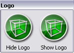
Now, switch the hotset to the test mode and, clicking the « Logo » hotbar buttons in turns, play with the logos hide-and-seek a full two hours!
- Important! A full two hours – for the hard-case nerds only! For those who are just very busy, a few clicks will do…
Mission complete. At this point, a particularly thorough Show-Logo Operator will exclaim: «Why on earth all the buttons have the same pictures?» Claim accepted. We are going to make up for it later on, when we get down to the application design and the ergonomics of the scene control environment…
Modifying Node (Transformation)
Either due to a solar flare, or the flare occurred in your head – all of a sudden, it dawned upon you: the Actor is sitting on to a low stool, and it does want to be slightly lifted. And you drop everything in a rush to lift up our Actor! (Hope, he hasn’t had dinner yet)
However, before creating a transformation action, find out exactly the required node name. To do so, use the simple method of hovering the mouse pointer over the Render Preview window image. So, when the mouse pointer hovers over the Actor, the application status line displays <World>.<Main>.actor (video_01).
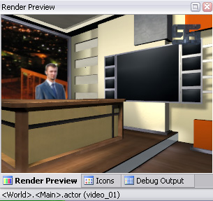
As you learned before, the word in parentheses – video_01 – is the name of the Actor material. And the word that precedes is the required node name – actor. (The still preceding string of words separated by dots – the parent node names in hierarchical order).
Now, that you know exactly the Actor node name, get down to business. Create a new action «Displace actor» by using the method learned before on the basis of the standard action «Modify Node». When on the first page of the wizard, select the «actor» node.
Next, find the Transform parameter in the created action parameters and select the «Yes» value. Hereupon, the Position, Rotation, and Scale parameters become available for editing.
Select the Position parameter and hover the mouse pointer over the Value column. A triple Up/Down box for entering the offsets along the Х, Y, Z axes respectively, shows up.
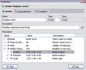
Since you want to move the Actor vertically up, change the Z value in the third field. Set a test value there, e.g. «1». Then, when playing the action, you understand that the value is too large (Sad spectacle: the dummy Actor hovers legless). Fit the offset value, every time playing the action again until the new Actor position seems ideal to you.
- You can enter the parameter values both from the keyboard and by using the scroll wheel – when doing so, the entry field must have focus.
By the way, to accurately fit the right offset value, you may first do it in the «actor» node properties (to do so, previously select the node in the list of the scene nodes) and then use it in the modify position action.
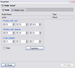
Resetting Transformation
After any transformation of one or several nodes (in this case, Actor), a natural question may arise: How can you reset all the changes? Perform depending on the current task.
Variant 1: It is necessary to reset ALL the scene nodes.
You can do this in several ways; choose one to suit your taste:
1. Click on the Reset All ![]() button in the Tools toolbar.
button in the Tools toolbar.
- The Reset All button only appears after clicking on the Start All
 button, the latter changing to the former. Note that the execution of this command not only resets the transformation of all nodes, but also stops the video streams, animation playback, restores the default material textures, etc.
2. Press <Ctrl-R> in the scene document window or in the Render Preview pane.
3. Use the Reset All Nodes command in the context menu opened by right-clicking on the free space in the list of the scene nodes:
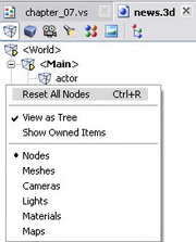
4. Create a «Reset Nodes» action in the project by dragging it from the “factory” of standard actions. The advantage of this method is in that you can assign this action to a separate button of the hotset and push it when necessary.

Variant 2: : It is necessary to reset a specific node in the scene
You can do this in several ways as well:
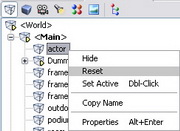
1. Use the Reset command of the selected node context menu.
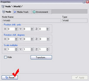
2. Click on the Reset button in the bottom of the properties pane for the selected node.
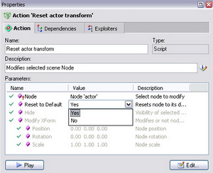
3. Create a «Modify Node» action, select the required node, and set «Yes» for the Default parameter in the action properties. After playing the action, the node will be always reset. The corresponding button may be placed in the hotset.
Manually Adding Action to Startup
You like the “elevated” state of the Actor so much that you felt an impelling urge to make it default. But when creating the “Displace actor” action, you did not check the option of adding to project Startup. Never mind – you are going to add this action to the Startup playlist manually.
Make sure the Startup action is displayed in the Editor pane. If not – open it by clicking on the Edit Startup Action ![]() button on the project window toolbar. Now, simply drag the “Displace actor” action from the project window to the Startup action playlist.
button on the project window toolbar. Now, simply drag the “Displace actor” action from the project window to the Startup action playlist.
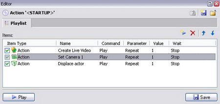
As soon as the action shows up in the playlist, push the Save button in the bottom of the editor pane to save the changes in the Startup action.
Now, when initializing the project, the Actor will take the prescribed position. If you don’t believe this, close the project having saved the project file changes, then open again and click Start All ![]() . The Actor – suddenly – up and jumps to the proper position!
. The Actor – suddenly – up and jumps to the proper position!
Modifying Other Scene Items
Modifying visibility and position are just simple examples of modifying “node”-type scene items. As your homework, you can figure out modifying light and material properties, as well as cameras.
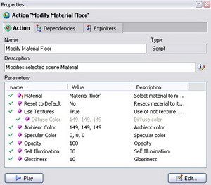
First, drag the standard actions «Modify Light» and «Modify Material» to the project (as for setting camera actions, they had been created as far back as in Chapter 6). Then, by changing various parameter values in their properties, watch the result (do not forget every time to play the action with the modified values, or otherwise, you are not going to see anything!).
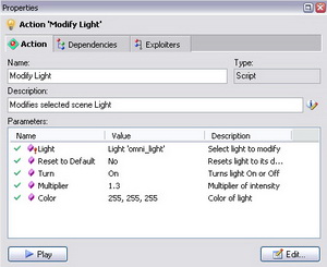
Since we only use textured materials in our studio, switch off using textures to have greater obviousness. To do so, disable using textures in the action properties.
If you cannot spare time for home experiments – never mind: in real practice, modifying the properties of materials and lights is used rather seldom.
Playing Animation Tracks
In this Chapter, you are going to take up playing the animation of the nodes, – or their animation tracks. Note here that animation tracks for nodes were created as far back as when preparing the scene in the 3D editor (Autodesk 3DS Max). If no tracks in a scene are made, – then there is nothing to play.
You learned how to determine the nodes that have their own or nested animation as long ago as in Chapter 3, namely, by the yellow and green arrows in the list of the scene nodes. You are going to use this knowledge now.
Playing a Specified Track Fragment
For a start, try to zoom in on the Actor from camera 1.
If «Camera01» is currently inactive, activate it by using the appropriate button on the hotbar or by double-clicking in the scene list of cameras (you must be good at that, sure if you didn’t shirk previous lessons).
Activate the scene document «News.3d» and examine its node tree. The first thing that leaps to the eye is the yellow arrow in the «<Main>» node – ![]() . Hence you draw the conclusion that «<Main>» has a nested animation, that is, child node animation.
. Hence you draw the conclusion that «<Main>» has a nested animation, that is, child node animation.
Probably, for the camera animation, it is enough to simply play all nested animation of the «<Main>» node?
You are going to test this assumption: select the node and move the playback slider of the scene document. Watch the object movements in Render Preview. Indeed, the camera is animated now, – but besides it, say, a lot of unnecessary things move as well. So, examine the lower-level node with the green arrow, – «Dummy01», since “Camera 01” is its direct child node. Select the node in the node tree, move the slider and make sure only the required camera moves, no unnecessary things besides. Then, you are going to play exactly the “Dummy01” track.
But before you rush to create the playback action, determine within what time interval you are going to play the track. The movement will start from the start position, so to determine just the end position will be enough. And you do so using the playback slider. Slowly move the slider to the right, watching the camera travel, until its slow zoom-in on the Actor stops. (Note, the current position is displayed in the indicator on the right of the slider.)
When the slider has focus, you can navigate the track more accurately using the Left/Right arrow keys, – by doing so, you move exactly frame by frame to the required direction.
Suppose, you see that the camera movement sharply changes, – zoom-out starts, – exactly from the fourth second, – then the end position of the camera track fragment is «00:00:02:10». You may copy this value from the position indicator window to the clipboard by selecting the indication and pressing <Ctrl+C>.
Armed with the prior knowledge, find the «Control Node» action in the list of standard actions and drag it to a free area in the hotset.
On the first page of the wizard, select the required node «Dummy01» in the list of nodes and move on…
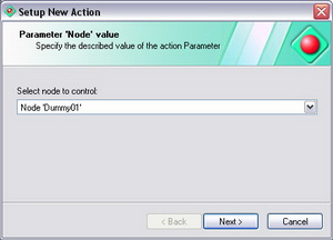
Then, you are prompted to select which exactly node control command you want to be executed. The default is Play which is what you need. (You may look through the list of available commands, – in principle, their functions are intuitive enough to be easily understood).
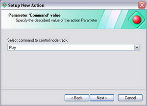
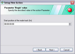
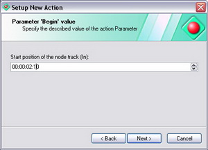
On the following two pages, you are prompted to enter the start (In) and stop (Out) time positions of the track.
On the former page, leave «00:00:00:00» as is, since your animation track starts exactly from this point.
On the latter page, enter from the keyboard or use the scroll wheel to specify the value «00:00:02:10».
If the value be providently copied by you to the clipboard, it is high time you pasted it here using <Ctrl+V>
On the last page of the wizard, enter the action name «Play to Close-up View», - there you are, a new button is now in the hotbar “Cameras”:

Switch the hotset to the test mode, push «Play to Close-up View», and make sure the camera starts the movement with the studio general view and stops when it shows the Actor’s close-up (thereby, allowing us to “admire” his half-assed TV make-up).
So, your Actor is zooming now (sure, in the finest sense of the word)! No doubt, right after this you will want to make a button to start the backward motion of the camera in order to return to the studio general view when necessary.
Playing Track Backwards
By analogy with the hide node/show node actions, you are going to create the action of backward camera movement not by using the standard action, but by duplicating and subsequently changing the «Play to Close-up View» action parameters in the properties pane.
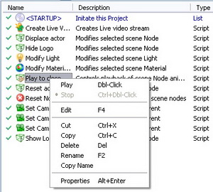
So, copy the «Play to Close-up View» action to the clipboard and paste it right off.
А «Play to Close-up View 1» name is automatically assigned to the clone of your action, which is not true (since Views and their listing have nothing to do with all this) – so, rename it to «Play to General View» soever: by the Rename command of the context menu or in the properties pane. Now, in the properties of this action, you are going to turn the track backwards.
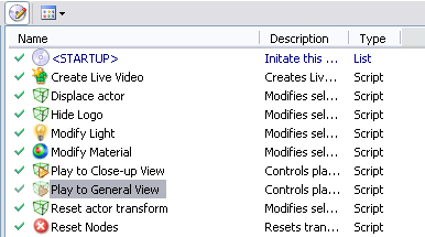
- To play animation track backwards, there are two ways:
- 1. swap around the start and end positions.
- 2. change the Speed parameter value to opposite in sign.
The second way, being less obvious, is quicker in return. So you use it, manually adding a minus sign in the entry field of the playback speed parameter.
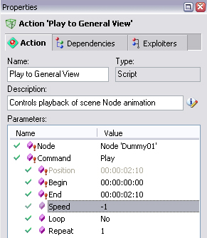
While you are about it, push the Play button in the properties pane and make sure the camera has zoomed out to show the general view again (for the Actor to be able to relax his face and breathe again at last).

Drag the action to the “Cameras” hotbar to create a button on the right of the Close-up-View button (meanwhile, it will be recalled for the umpteenth time already that the hotset test mode must be off when creating/changing hotbars).
Now we can easily move from close-up to general view back and forth.
Stopping Playback
As was said before, the playing tracks are all stopped by the global command Reset All, – however, if you want to stop a particular track, it is better to create a special stop action. To do so, you may use the standard action «Control Node» and select the Stop command in the wizard. But you may also create the stop action by using the replication method of the ready playback action and then slightly modifying its properties.
Let’s make a stop action for camera 1 by using the «Play to Close-up View» action. Replicate the action (<Ctrl-C>, <Ctrl-V>), then change its name to “Stop Camera”, and the Command parameter value – from “Play” to “Stop”.
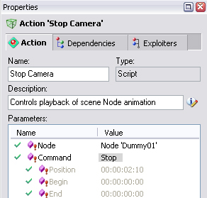
Create a button on the “Cameras” hotbar by dragging there the stop action. Check its availability: start “Play to Close-up View” and in a couple of seconds, push the “Stop Camera” button. If everything is done properly, the camera stops “in its tracks” somewhere halfway.

OK! Now you are going to perform the zoom-in operation up to the end by clicking again “Play to Close-up”. But what you see is different: instead of proceeding from the stopping point, the camera jumps to the start position and starts its movement anew from there. You scratch your head in confusion. But there is no mistake here: a playback command for playing a track fragment always plays it from the very beginning. But to continue moving from an arbitrary stopping point, you will have to use another playback command – Play to Position.
Playing to a Specified Position
For a start, you should know the difference between a playback command for playing up to a certain position and a playback command for playing a track fragment we used before.
Play-to-position command only uses one parameter – end position, up to which the track must play. And the current position always acts as the start position, no matter whether the track is stopped or playing now.
If the specified position is already gone past when executing the command, the track may start playing backwards to still come to the specified position.
If the track is already in the specified position when executing the command, no movement occurs since the final goal is achieved.
To get the knack of this command, without creating new items, simply change the parameters of the actions that perform the zoom-in and zoom-out operations on camera 1. In the “Play to Close-up View” action properties, first copy the End value to the clipboard, then select the “Play to Position” command. After that, the Position parameter becomes available, wherein you paste the value «00:00:02:10».
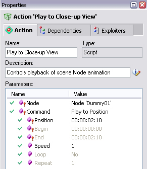
And as for the «Play to General View» action, it is enough to just change the command itself without changing the position: it is zero by default, which suits you. The negative value of the movement speed may not be changed as well, since playing to position is performed in the “shortest route”, and the forced value of the moving direction is ignored.
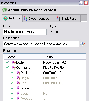
Now, test the changes. Wherever you stop camera 1 movement, when subsequently performing zoom-in or zoom-out actions, it moves from the stopping point to the required position of the close-up or the general view, which best suits the case, doesn’t it?
Instantly Setting to a New Position
The last command that remains in the list of possible commands for playing animation track is Set to Position. If you learned playing track to a specified position, this command will be easily understood.
The Set to Position command instantly sets the track to a specified position regardless of the current playback state.
You can easily try the command by temporarily changing the zoom-in/zoom-out actions and making sure the camera instantly jumps to the general view or close-up view. But if you want, you can create some dedicated actions for this purpose, name them, e.g. «Jump to Close-up» and «Jump to General View», and then place the respective buttons in the hotbar.
Set-to-position actions can be added to the Startup action if you want the scene objects to take the required positions instantly at the scene initialization.
Looped Playback
Looped playback of tracks is used quite often. Suppose you want the logo in the frame corner to spin continuously, although just one turn is specified in its animation track. To repeat a track fragment either endlessly or a specified number of times, use the “Loop” or “Repeat” parameter in the playback actions.
The Repeat parameter in the playback action properties is used to specify the number of playbacks of the required track fragment, while setting the Loop parameter makes the number or repeats unlimited.
On the basis of the previous experience, make a looped playback action for the first logo. Select the “Logo 01” node in the new-action wizard, and specify the playback fragment as «00:00:01:15», since the logo makes one complete rotation exactly during this time period. Name the action as «Rotate Logo» and select “Yes” for the Loop parameter in its properties.
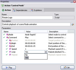
Note that a looped track may be stopped either by Reset All or by a dedicated stop action specially created for this purpose.
So, you can create the stop action “Stop Logo” right away, just in case; the more so, you know how to do this. If you add the “Rotate Logo” action to the Startup, logo 1 will start its endless rotation immediately after the project initialization. But do not rush to do so: there is a time for all things…
* Making Tracks Independent of Parent-Node Playback
In conclusion of the track-animation subject, here is an important note for future reference.
As you could see before, playing any node track by default causes playing the nested tracks, that is the child-node tracks, it there are any. However, some situations may occur when you want some of the nested tracks not to play, that is, to be independent of the “parent”. Suppose, you want to play the parent-node track “Node01” of camera 1, but without playing the animation of the logo, which is its child node.
To make the animation track of a node independent of its parent-node playback, create a “Modify Node”-type action for this node and set the “Not played by parent node” value for the Animation parameter in its properties.
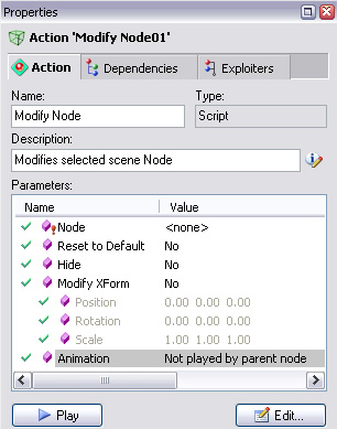
It is recommended that you add such actions to the project Startup so that certain nodes have this property right after the initialization. If there are many of such nodes, use groups, which will be discussed in detail in Chapter 13.
Assigning Image Files to Material Texture Maps
It must be admitted that it is pretty boring to observe the studio with the turned off TV monitor on the left of the Actor, so let’s turn it on and show at least the news splash screen there. In other words, in this Chapter you are going to learn how to use image files of your own as basic material textures. To begin with, briefly get acquainted with the texture map types that are used in our scenes.
Texture Map Types Used
Activate the scene document, switch on the Show Owned Items ![]() mode, and look at the list of materials. The maps that are used in textured materials are always displayed a level below.
mode, and look at the list of materials. The maps that are used in textured materials are always displayed a level below.
Each map name consists of two parts separated by a dot: the first part is the material name, and the second is the map type.
It is not difficult to notice that Diffuse maps are more frequent, whereas Reflection maps are less frequent. We are more interested in these very Diffuse maps (in spite of their “dissipated” name).
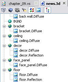
Diffuse map determines the main image visible on the material, so for simplicity, let's refer to it as basic map; other maps are considered to be additional.
Ambient map (which is used rather seldom though) is also among the additional map as well as Reflection map.
You can specify only one additional map in the 3D scenes of the Virtual Studio, so the maximum number of maps is two.
Creating Assignment Action
For a start, identify the virtual screen material as described in Chapter 5: hover the mouse pointer over its image in the Render Preview window and read the word in parentheses in the application status line – that is “Video 02”.
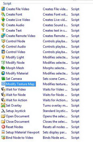
When you find the material in the scene list, you see it has only one, basic texture map (namely diffuse). You are going to substitute it for a file image. To do so, use the standard action “Set Material Maps” in the “Modify Item” group.
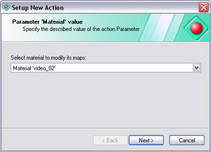
So, you drag the “Set Material Maps” action to the project window and select “Video 02” as the virtual screen material on the first page of the wizard.
Then you are going to select an image file for the basic map. Push the ellipsis button ![]() in the right of the entry field to open the standard open-file dialog box (you must admit, this button is the only case of ellipsis abuse in the whole tutorial…). Select the graphics file you are going to use as a splash screen. In this case, use Project\images\news.jpg
in the right of the entry field to open the standard open-file dialog box (you must admit, this button is the only case of ellipsis abuse in the whole tutorial…). Select the graphics file you are going to use as a splash screen. In this case, use Project\images\news.jpg
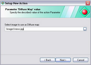
If you do not specify a file on this page of the wizard dialog box and move on, the basic texture map of the material will remain unchanged.
On the next page, you will have to specify the availability and type of the additional map. As you learned above, the “Video 02” material has only one (basic) map, so move straight on, leaving the option “None”.

If a specific type of additional map be specified on this page, on the next page you will be prompted to select an image file to assign to this map.
If an additional map is absent in the real material properties, but you have selected a certain type on this page of the wizard, – no result will be achieved after the action execution, since all texture maps are created as far back as when preparing the scene in the 3D graphics editor (that is, it is impossible to create neither basic nor additional map).
On the last page, name the action “Screen pix 1” and check the add-to-Startup check box for the splash screen to appear on the virtual screen right after the initialization.
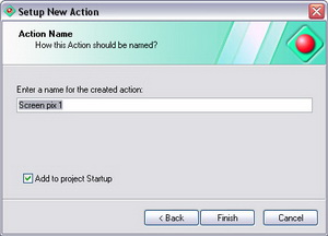
That’s all there is to it. Play the new action and rejoice at the new splash screen lit up on the virtual monitor on the left of the Actor.
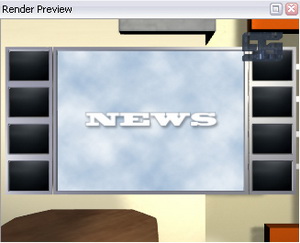
You can make a couple of similar actions to display other images, – e.g. by replicating and further changing the “Diffuse Map” parameter in the action properties. Create the appropriate buttons on a separate hotbar of the hotset (you can do it perfectly) and change the splash screen on the virtual monitor!
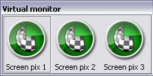
Assigning Video Files to Materials and Controlling their Playback
Look at the window of this virtual news studio, – you see a frozen image of a night city. Why not change this static picture you are sick of to a visually impressive dynamic scenery?
Note here that the technique for assigning a video file to a scene material dramatically differs from the recently-learned method of assigning static pictures. But don’t worry: the operations performed are very similar to assigning a video stream to a material (Chapter 5) and playing animation tracks (Chapter 8). Simply in this case the video stream will flow not from a real camera connected to the computer, but from a video file that snuggles on your bulky hard disk drive…
Creating and Assigning File Video Stream
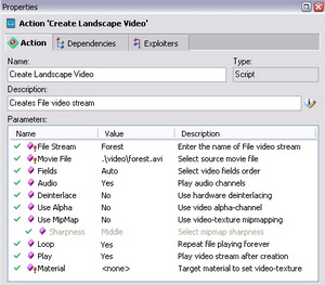
Here goes. For a start, the file video stream must be created. To do so, find the standard action “Create File Video” in the “Create Objects” group and drop it to the project window as is your habit.

Right on the first page of the wizard dialog box, you are prompted to enter the video stream name, which may cause slight confusion. It is all really simple: you are going to use this symbolic name in playback actions to abstract from a specific video file name (because it can be changed subsequently).
Name the prospective video stream in a stern and common way, like “Forest”.
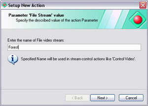
Next is the file-selection page. The open-file dialog box prompts you to select a video file of a standard type:.AVI, .MPEG, or .WMV.
Select forest.avi – the liveliest vid from our tutorial video collection. Against the background of pines rocking violently all over the place, our frail Actor is going to seem much more heroic.

Then you are prompted to select a material to assign the video stream to. Do not do this here and just push “Next” since you are going to select the material later on, in the video file playback control action.
On the last page, name the action “Create Landscape Video” and check the add-to-Startup check box for the video stream to be produced just once, when initializing the project, and not during the scene control procedure.
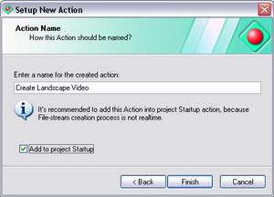
Creating video streams in real time may cause so-called drop-frames. This effect looks like short-time “freezing” of the picture in the Render Preview window.
Start the action and… Looks like nothing’s changed! No wonder, creating the action is only half the work: file video stream created. To complete the task, you need a playback action for the video to appear in the news studio “window” at your command.
However, if you want the video file to continuously play on the material after the scene initialization, you may manage with the only action of creating the video stream. In this case, select the required material right in the wizard dialog box, and then set “Yes” for the “Play” parameter in the action properties. Then, after the action execution, the video stream is not only created, but played on the selected material right away. The playback parameter Loop is often used in this case.
Playing the File Video Stream
So, start making the playback action by using “Control Video” from the “Playback Control” group as a basic action. Since you need the control button, drag the action right to the hotset and name the new hotbar, e.g. “Outdoor”.
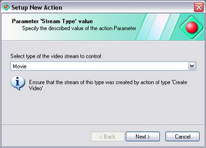
On the first page of the wizard, select the type of the video stream you are going to control. Since it’s a file video stream, leave the default value.
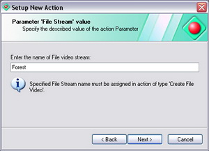
On the next page, enter the name that was assigned to the video stream when creating, that is “Forest”.
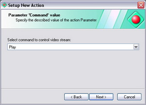
Next, select a control command, – to be more precise, leave the default value “Play”.
On the next page, select the material on which your video will be played. Since the technique for identifying the material name is already learned by you, you know the right answer. It is “Window”. Now, select this material in the drop-down list.
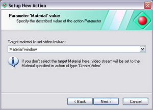
On the last page, name the new action as “Display Forest” and close the wizard.
While you are about it, create an action for putting the video on pause (to let the wind gain strength in order to sway the pines with renewed force then), and the stop action. Replicate the “Display Forest” action (doing it twice) and change the clone-action names to “Pause Forest Playback” and “Stop Forest Playback” in their properties, and the respective commands to “Pause” and “Stop”:
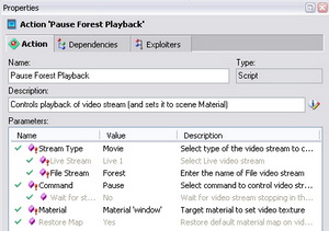
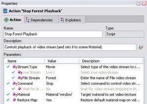
Note the parameters Restore Map and Wait Stop.
If the Restore Map parameter is set in the video playback action, the original texture map will be restored in two cases:
1. if you use the Stop command;
2. if you use the Play command when the Wait Stop Parameter is previously set. By the way, in this case the button assigned to the action, remains clicked during the video playback.
Next to the “Display Forest” button, create still a couple by dragging the pause and stop actions to the “Window Landscape” hotbar. Click Start All, assume an imposing air, and push the Forest control buttons making believe you are no less a person than the Woodland Potentate if not the World Rooler.

Improving Scene Control Interface
Look at the hotset of this constantly developing project. If you did everything in compliance with the guidelines, now it may look like this:

Looks pretty monotonous, doesn’t it? Linear button rows, similar icons whose images match the corresponding commands in a most tentative way… It stands to reason: hightime you dropped everything and got down to improving the hotset appearance, since it is the scene control interface!
Note: all operations for changing hotset objects are performed in edit mode only. One of the most obvious indications of the mode is the dotted grid displayed on the hotset (provided the default option Snap to Grid is turned on in its context menu).
Grouping the Buttons by Separators
You could start with the simplest thing first – inserting separators in the appropriate places to provide grouping buttons within separate hotbars.
For example, separate the “Play to Close-up View” button in the “Cameras” hotbar from the rest of the buttons. First, select the button before which you want to put in the separator (a thin gray frame will appear around the selected button). Then, open its context menu and select the Insert Separator command or simply push <Ctrl+Insert> on the keyboard.

Similarly put in one more separator before the “Set Camera 2” button and observe this obvious improvement in the hotbar perception:

You can put separators in other hotbars as well. Note the following things:
The insert-separator command does not work if a separator is already put in on the left of the button or the button is first left in the hotbar.
If you want to remove a separator, – first, select it, then use the Delete command from the context menu or simply the <Delete> key.
For the hotbars not to look too long, you may change their size with the mouse the same way you change the size of usual windows, the buttons being carried over to the next line.
What is carried over first when changing hotbar widths, is whole button groups separated by the separator. In this case, a horizontal separator will appear additionally in this vertical row.
For example, this is what happens if you reduce the “Cameras” hotbar width.
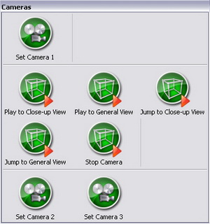
Moving Buttons to Other Hotbars
Give the hotbar a critical look. The “Mobile Camera control” buttons are separated by a separators. And yet, it would do good to place them on a separate hotbar (say, for the lack of chemistry between them…). And so you do.
Sure you can first remove the buttons, and then create a new hotbar by dragging the corresponding actions from the project window to the hotset. But this time you are going a different way: first create an empty hotbar. There are two methods to do so. They are used to create not only hotbars but other controller types as well.
1. Using the Hotset Context Menu:
Select New Controller… in the hotset context menu. A dialog box for selecting a controller type opens. Select Hotbar:
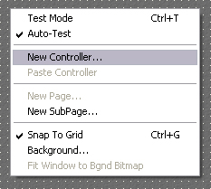
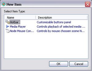
When you then enter the name, the hotbar will appear in that same hotset point where you right-clicked to open the context menu.
2. Using “New Items” Pane:
Activate the New Objects pane and expand the Controllers node to see all available controllers in HA.
Drag the “Hotbar” item to the hotset place where you want it, and enter the name you want, – there you are, the new hotbar!
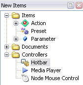
We recommend that you master both methods and then choose between them depending on the situation.
When the new hotbar has been created, it only remains to drag the required buttons from the other hotbar to it.
In order not to drag the buttons one by one, you can first select the required buttons consecutively while holding the <Ctrl> key, and then drag them all at once. You can use the multiple button selection during other operations with buttons as well: copy, cut, delete.
This is what you have after dragging the buttons:

One more note about handling hotbars and other controllers:
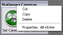
If you want to rename, delete, or copy a whole controller, – use its context menu opened by right-clicking on its title bar. A left click on the title bar activates the hotbar properties.
So you can go ahead and “shovel” the layout of the hotbars and buttons, which is going to improve your hotset. However, the button icons being not completely adequate to the commands executed, do not make you very happy. Want to increase your joy factor? Use more appropriate icons for your control interface!
Icon Functions
Activate the Icons pane, which is used to select icons to assign to hotbar icons or actions. It is quite simple to handle the pane toolbar buttons, – just read the tooltips and try each button. No fear, nothing’s gonna be damaged.
The procedure of assigning icons to hotbar buttons and actions is most simple: drag the desired icon onto the required button or action. Note: if the icon can be assigned to the required object, a green tick follows the mouse pointer.
Pay special attention to small icons like those in the next Figure, – their names start with “ov”. These icons are recommended to be used as overlays, that is images that are layed over the basic icons.
In terms of properties, all icons are equal in rights: the division into basic and overlay icons is very relative and has to do with the nature of the image.
As a rule, basic icons are symbols of objects (like node, camera, picture, etc.), whereas overlay icons are symbols of operations that can be applied to objects (play, modify, shift, etc.).
Overlay icons can also be assigned by simply dragging onto the required button while holding the <Shift> key.
No strict guidelines on how to select icons be given, since design is a matter of your taste. But note just in case: the icons have names that correspond to the commands recommended. These icon names are displayed when switching on the Text Labels mode ![]() in the icons pane toolbar.
in the icons pane toolbar.
For example, after assigning icons according to the logic of the commands executed, the hotset may look like this:
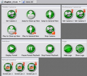
In principle at this point of the narration, you may proceed to the next part of this Chapter, – «Modifying Hotbar properties», but if you want a more detailed information where this application reads these icons from, how their collection is arranged, and how to add to it some images of your own, – read this part to the end.
Open the combo box in the left of the Icons pane toolbar and look through its list from top to bottom. The first main tree is the Standard Icons folder, and the second is the Project Icons folder. When you select it, the pane window displays the icons already assigned to buttons (by the way, when assigned, they are automatically copied to the project subfolder Icons)
The window always displays the contents of the currently selected folder and all its subfolders. Thus we can see all available icons on the top level of the tree (at the root).
Note, that right under the Standard Icons folder, there is a folder whose name is a file pathname that ends in «…Сommon\Icons». From there “sprouts” the subfolder tree that completely duplicates the structure of file folders in the path <folder with HotActions30.exe>\Common\Icons. You can make sure these file folders contain the Windows Icon (.ico) or Windows Bitmap (.bmp, with transparency) images that you can see in the pane window.
You can create subfolders of your own with .ico or .bmp files in Сommon\Icons thus supplementing the standard collection of the application icons.
As an icon source, you can use folders created in other places as well. To do so, go to the application general settings: using the Tools submenu of the Main Menu or the Tools toolbar, open the Options panel. In the Common Media Folders tab, select the Icons media type in the combo box. Then, using the button, add additional icon folders to the list in the lower part of the tab. Each folder added to the list will appear in the Icons pane along with its subfolders in the Standard Icons tree, and its contents will become available to select images:
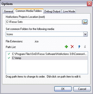
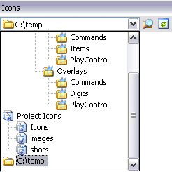
Modifying Hotbar Properties
You are supposed to study this subject mostly on your own. To display properties of any hotbar, click on its title bar and and then select the Hotbar tab. You should examine it carefully.
Short annotations on each control element in the hotbar properties:
Image check box – enable/disable the images on the buttons, in the latter case leaving on them the text only .
Aspect combo box – selecting the aspect ratio of the buttons (square by default).
Use Alpha check box – enable/disable alpha channel (transparency) for Windows Bitmap (.bmp) icons. This option does not apply to Windows Icon (.ico) files since they use transparency always.
Width, Height – the height of the used icons in pixels. When the Custom aspect ratio is selected, you can enter width as well; when selecting other standard aspect ratios, the width is set automatically.
Hue – hue shift for all hotbar icons.
You can also change the color hue of individual buttons in their properties, in which case the hotbar hue shift is summarized with the individual hue shift of each button.
Text check box – enable/disable the text signatures on the buttons, in the latter case leaving on them the image only.
Place combo box – selecting the location of the text relative to the icon.
Font check box enables a custom font, which can be selected with the Change button (opens the standard font-selection dialog box).
Using the Buttons order list, you can change the current sequence of buttons (by dragging) and perform standard editing operations by using the context menu or keyboard commands.
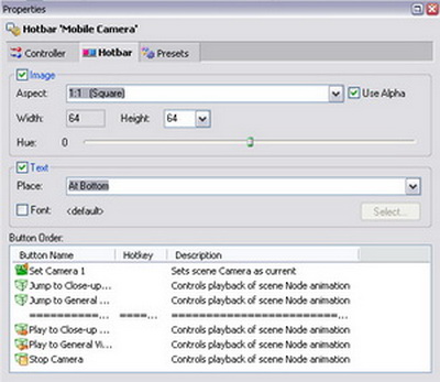
Go ahead and explore the hotbar properties. Above all – do not forget to hit the Apply button! . When you get mixed up and want to return it all back – use the Main Menu command Edit / Undo or the <Ctrl-Z> key combination
Controller Title Bars
A few words about the controller title bars that display the controller names. In some cases, the presence of a title bar may seem unnecessary to your good self. All right then, – you are the boss here. It is very simple to hide a title bar.
Select the Controller tab in the hotbar properties. There are as many as two options for displaying the title bar: hide it when in Live Mode (including the test mode) or not show it at all.
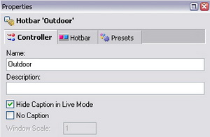
However, we do not recommend that you disable the title bar (latter option) exactly for hotbars, since in this case their relocation in the window will become problematic.
For example, you may disable title bars in Live Mode for a couple of hotbars, e.g. “Items” and “Virtual Monitor”:
Finally, after some simple manipulations with the hotbar properties, your hotset may look like this:
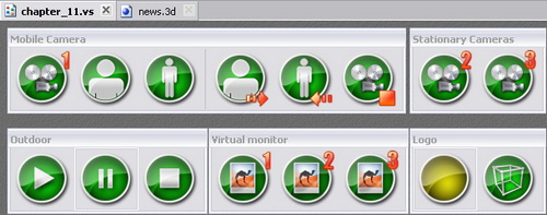
Assigning Background to Hotset
Probably, the dark-gray substrate of the hotset seems boring to you, and you want to use a background of your own. All right then, no problem!
Select Background… in the hotset context menu. The Select Background Type dialog box opens:
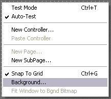
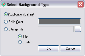
Using the dialog box is intuitive enough to be easily understood. When spot color is selected, click the color button and assign another color in the standard color-selection dialog box. But if you want to use an image file, – click the ![]() button, select a Windows Bitmap file in the standard open-file dialog box, and specify the way to display the image: Tile or Stretch.
button, select a Windows Bitmap file in the standard open-file dialog box, and specify the way to display the image: Tile or Stretch.
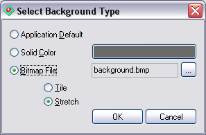
As an example, assign the graphics file images\backround.bmp as a background and set the Stretch display mode.
When in the Stretch mode, the image fits into the visible area of the hotset without keeping the original size and aspect ratio. The same occurs when switching to the Live Mode: the hotset window is fitted to the layout of all hotbars, and the background image is scaled again according to the new window size.
So when the background with the Stretch mode is assigned, the hotset window when in global Edit mode may look like this (image shrunk horizontally):
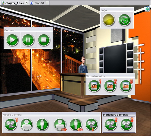
…and when in Live Mode – like this (still more shrunk):
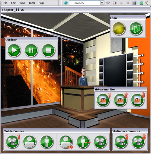
Fitting Hotset Window to Background Image
You see, the image is distorted. Probably you would like to save the original aspect ratio of the image so that the hotset window is fitted to the background image, but not to the layout of the hotbars.
To do so, use the option Fit Window to Bgd Bitmap in the hotset context menu.
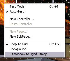
When the option is turned on, the hotset will look like this when in the global Edit mode:
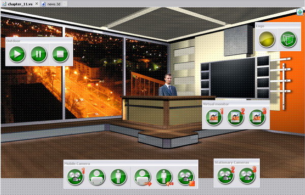
As you can see, the hotset area outside the background image is gray. And when you switch to the Live Mode, the hotset looks like this:
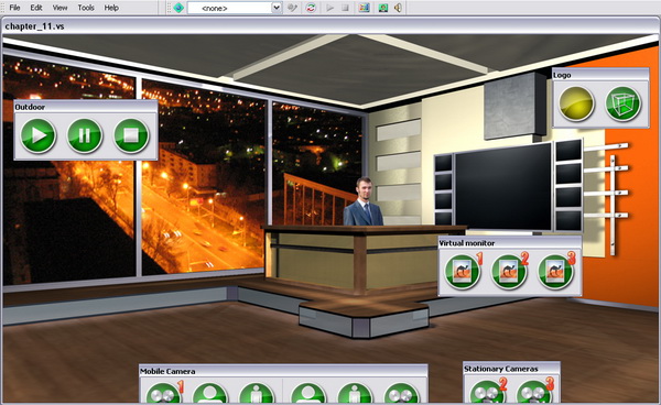
You see now, when in Live Mode, the hotset window fits the image pixel-for-pixel, “hardly caring” about the visibility of the hotbars, so “Cameras” hotbars came off a bit cropped, which ain’t pretty. Inference leaps to the eye:
If you see in Edit mode some hotbars fetch up in the gray area outside the image, change their layout or find a background image of another size.
Playing Actions Using Playlists
It is all quite simple if you need to perform a single action with a button click, e.g. shift an object, start a track, switch to a camera. To do so, you create the required actions based on the standard actions. However, sooner or later you will face a situation when you have to handle several actions simultaneously or successively. For example, you will have to switch to a camera, display a caption meanwhile, start a zoom-in animation therewith, and display a certain video on the virtual monitor thereupon.
Wondering what is to be done in such cases? Hit several buttons with several mice simultaneously and then, – dripping with sweat, – watch for the end of the track? Relax, you can breathe again: to solve problems like this, there are special playlist actions.
Playlist actions can play simultaneously or successively actions of any type (including other playlists) and also execute special commands when playing (delay, pause, etc.). Using these actions, you can create various scene control scripts.
A vivid example of a playlist action is the project Startup action: when running it, the initialization actions of specific scene objects are played.
Successively Playing Actions
Suppose you have a task to successively perform as follows: switch to camera 1, wait a second, play the zoom-in track, then switch to camera 3, wait two seconds, switch back to #1, and zoom it out. Exactly this very succession was selected since all actions that perform the above-listed operations had been created previously.
For a start, create an empty playlist. And, as usual, there are several methods to do so.
Method 1: in the New Items pane, find a “Playlist” item and pull it into the project window.
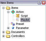
Method 2: in the project list of actions (right part of the project window), open the context menu and select the New Item option. When you are prompted to select the type of the new action, select Playlist.

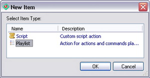
You can create a new item in the project window list of items not only by using the context menu option, but also by pressing the <Insert> key or simply by double-clicking on the free space in the list.
Regardless of the method selected, in the next stage you have to enter the new action name (you may well leave this pretty original for a playlist name as “Playlist”), whereupon the action is automatically opened in the Editor pane.
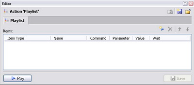
Straight away, create the start button by dragging the “Playlist” action to a free area in the hotset. You can rename this button for better comprehension to “Play Playlist” by entering the new name in its properties (which, by the way, reveals a little secret: a button name and the action name started by it may not coincide).
Now, you will have to drag the actions that you want to play in succession, from the project window to the playlist-action items list open in the editor. You may pull the actions into the list one by one, but you are going to act in a more effective way: first, select the required actions in the project window while holding the <Ctrl> key, then, drag them to the playlist list in the whole pack.
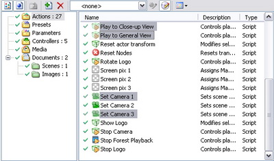
Note that actions that have just been added to the playlist will be played in succession. The playlist last column Wait speaks to it: the default End is set for each action, which means ‘wait for the end of this action playback before start the next’. This option is especially critical for actions that have a long playback time (e.g. playing animation tracks).
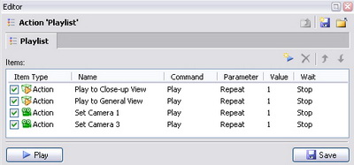
You see, right after dragging the actions to the playlist, their sequence order turned out to be incorrect.
Set the required sequence order by moving the actions upward or downward or using the arrow buttons in the editor toolbar.
Here is an important note:
Avoid adding a playlist action to itself at any nesting level (e.g. playlist B is added to playlist A, and then to playlist B – again playlist A). An action added to itself just will not be performed in order to avoid looping and system memory overflow.
So, your mini script is almost ready. There remains only one question: how to insert the necessary 1-2-second delays between playing separate actions?
Time Delay
Time delay is made by inserting a special command to the playlist. In the list, select the action after which you want to insert the delay. Then use the context menu command Insert Command or the New Command ![]() button in the editor toolbar.
button in the editor toolbar.
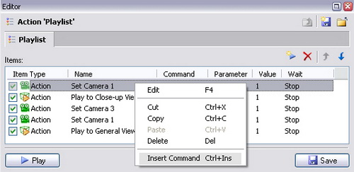
Exactly the required 1-second delay command is inserted by default. The delay time is entered from the keyboard or by using the scroll wheel in the Value column in the SMPTE format (scrolling increment is one second). Insert delay commands to the required places in your playlist and set the delay value equal to two seconds after the “Set Camera 3” action.
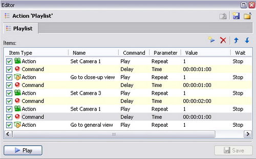
Now, to be on the safe side, save your playlist action with the Save button in the bottom of the editor pane, push Play, and carefully observe what happens in the Render Preview window. If anything goes wrong, – check once again the names and sequence order of the actions added to the playlist.
Repeatedly Playing Actions
Look at the Parameter column of your playlist. For the actions added to the playlist, it reads Repeat, the default value being equal to “1”. It is easy to guess that by changing the value, you order this playlist action to play the specified number of times.
To test this, remember the previously created action “Play Logo”. This action starts the looped logo playback. However, for the purpose of this test, turn off the loop option for the logo to make just one turn.
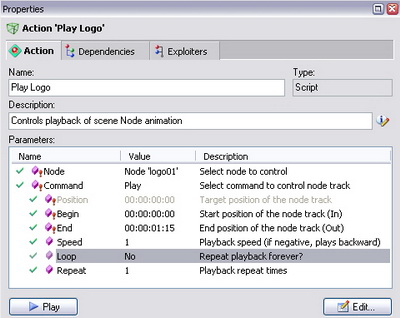
Drag the “Play Logo” action to the playlist, right after the “Set Camera 1” action. Note, the red horizontal line allows you to accurately select the place for the new insertion in the playlist. In the Value column, scroll the value to “3” for the Repeat parameter and test the playlist.

As expected, the logo makes three turns, and only after that, the camera zoom-in starts.
By setting an extra large value for this parameter, you can realize in essence an “endless” iteration of the action. In this case, to interrupt such a playback, you will have to create a special stop action (see further below).
Concurrently Playing Actions
Note, the above-created playlist action consists of actions played in succession. However, this is not a rare occasion when you need to play two and more actions concurrently (or rather, to start their playback simultaneously). Concerning this case, suppose you have a task to start the logo rotation and camera zoom-in simultaneously.
In order not to wait for the end of a certain action playback in the list and to start the next one right away, reset the value for it in the Wait column to <not set>. In this case the action with the reset value and the next one will start the playback simultaneously and further play concurrently. But note here, the playback ends of these actions never depend on each other. You can reset the wait value for several actions running, and they will all start the playback simultaneously until the first action for which the end-wait value in the line above is specified (not reset).
Test it out. Since you are not going to wait for the logo rotation end, positively reset its end-wait value.
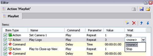
Test the playlist and make sure everything works as you originally planned: the logo rotation starts with the camera zoom-in, but the playback end of the former one is never waited. Now, if the iteration number of the logo rotation be incremented, say, from 3 to a million, – no harm done.
Here is a note for future reference. In some cases, it is required that all actions be played concurrently. In order not to torture the user with the tiresome clicks in each line, there is a special accelerative device:
If you want to perform all playlist actions concurrently, you can reset the end wait for all actions at one go, by using the playlist context menu command Reset All Wait Events.
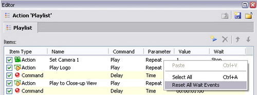
Temporary Removal from Playback
It is intuitively clear that if you want to remove an action from playing in the playlist, you can do it by using the context menu or with the toolbar button, or the <Delete> button (no fear, the action is not deleted from the project itself). However, in some cases it proves useful to temporarily remove an action from the playlist (e.g. when adjusting it).
To remove an action or command from the playlist, uncheck the checkbox on the left of its name. The corresponding playlist line becomes inactive (grayed out), and its value in the Wait column is ignored.

Concerning this case, it may be temporarily removing the “Rotate Logo 01” action. Now, test out the aforesaid to see it is quite a convenient feature for adjusting and fine-tuning scripts.
Pausing and Continuing the Execution
In your playlist, you set a two-second delay after switching to camera 2. However, in many cases you cannot guess the exact delay time in advance in such and such script places. What is to be done in such cases? Break the playlist in a place like this and then start the next, – or just sit around in frustration? Neither of the two, – it will be enough to use the Pause command instead of the Delay command.
The Pause command in the playlist pauses its continuous playback until the operator gives the command to continue: clicks again the playlist playback button or executes the Continue command from another action.
So, highlight a line with the Delay command and select the Pause option in the Command column combo box:
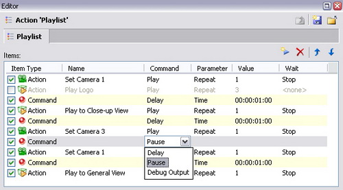
Click on the hotset button and play the playlist. When the played sequence comes to the point of switching to camera two, it pauses and waits for the continue command. The pressed state of the button and the playback status icon in the upper left corner changed now to the pause symbol attest to that. And when hovering the mouse pointer over the button, a blue triangle is added to it (in terms of symbols, that means “Click me to continue!”).

Click on the hotset button again, and the rest of the playlist script is played all the way to the bitter end. By the way, it is to be played to the end not only by clicking the button, but also when using other standard methods for playing actions: when clicking Play in the editor or properties, using double-click or the action context menu.
The Pause command is going to be especially useful when displaying a sequence of slides on the screen of virtual monitors: you fill the playlist with actions that assign images to the monitor material and separate them with pauses. To show the next slide, you will have to click on the button of the whole slide show each time.
Note that you can continue the playlist from the pause not only by clicking again on the appropriate button, but also from another action. Here will explain how to do this.
Create a new playlist action and name it “Continue”. Add one and only one action to its list, – your basic “Playlist”. Now, change the default value Play to Continue in the Command column.

You can make sure that playing the “Continue” action in any way, continues the “Playlist” action playback if it has been paused.
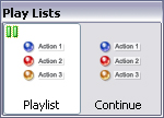
Stopping the Action Playback
It may be conceived that if playlist has the ability to be paused, it must have the ability of early stopping. Because you know that playlists may be very long, and sometimes there is no possibility to play one to the end. It is clear that the global command “Stop All” stops all playlists played, but in this case, you are interested in the local stopping of a specific action.
Start the basic playlist again, and when it plays, hover the mouse pointer over the hotset button “Playlist” while holding the <Ctrl> key. Now the stop symbol is added to the mouse pointer. Click the button while holding the key and the playlist execution is stopped as expected.
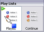
Action that is being played can be stopped by several different ways:
1) clicking on the corresponding hotbar button while holding the <Ctrl> pressed;
2) double-clicking on action in the project window while holding the <Ctrl> pressed;
3) choosing the Stop command from action’s context menu;
4) pressing the Stop button in the edit window or in the property window (Stop button appears at the place of Play button when current action plays).
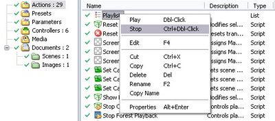
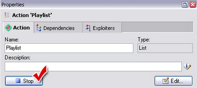
Note that all above-listed ways to stop apply not only to playlists, but to all other action types. But note here:
Do not confuse stopping an action with stopping the track started by the action! If the action that had started the track, is stopped, – the track continues the playback up to the end position all the same, and you need a special stopping-track action to stop it. (A vivid analogy: the catapult has been broken right after the shot, but the discharged stone continues to fly) The same refers to video file playback actions.
An action can be stopped not only by using the <Ctrl> modifier, but also by creating a special stopping action. If slightly above you gave yourself the trouble to create the “Continue” action, creating a “Stop” action is going to be a pushover, – just this time select the Stop command instead of Continue command for the “Playlist” action.
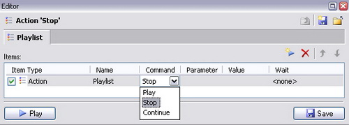
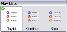
So, stopping a whole playlist comes down to interrupting the currently played action from the list, whereas the remaining actions are ignored. But there are also other ways to stop, without stopping the whole playlist.
To stop a specific action in the playlist list and proceed to the next one, further playing the playlist, you need to give the Stop command not to the whole playlist action, but to the specific constituent action. This may be especially critical when stopping playlist actions with a looped playback.
If you are eager to try the device described above, return the end-wait in the Wait column to the “Play Logo” action. And now, create the stopping action for it by using the learned technique: create a new playlist named “Stop Logo”, add the “Play Logo” action to its list, and select the Stop command for it. Note here, you are going now not to stop the logo-rotation track (as was done in the “Stop Logo” action), but the action that starts the rotation track!
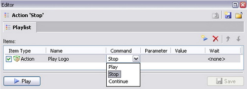
Test what you have done so far. As soon as the logo starts spinning, start the “Stop Logo”. The Logo makes one full rotation, but the playlist continues to play the remaining actions as cool as you please. Too little to call it a big deal!? Call it a day!
* Actions for Playing and Stopping the Whole Project
Maybe, you noticed the two mysterious buttons in the Main Toolbar as far back as when you were getting acquainted with the program interface. Their names are “Play/Continue Project Scenario” and “Stop Project Scenario”. Though the buttons are grayed out and “unclickable”… What are they for, and how to activate them?
The Play/Continue Project Scenario and Stop Project Scenario buttons in the Main Toolbar are used for the fast start and fast stop of the main project script.
Any action that has the system name <PLAY> can stand as the main project script (as a rule, a playlist action is used). If the project contains an action with this name, the Play/Continue Project Scenario button becomes available, and by clicking on it, the action starts playing. In this case, the Stop Project Scenario button becomes available as well, and by clicking on it, performs the usual stopping of the <PLAY> action.
If the project contains an action with the system name <STOP>, when clicking on the Stop Project Scenario button, it will be additionally played after the the usual stopping of the <PLAY> action procedure. As a rule, the <STOP> action is also a playlist and it is created to stop still other actions and/or to bring the scene objects to a certain state: e.g. reset the node transformations or return all tracks to the starting position.
What the main project script is, – it’s up to you to decide since you are its Creator.
Let’s use the recently-created “Playlist” action as the main script, and the “Stop Playlist” action as its “stopper”.
To do so, simply change the “Playlist” action name to “<PLAY>”, and “Stop” – to “<STOP>”. Take notice of the angle brackets in these names! By the way, after the renaming procedure, the “Play” and “Stop” buttons will reference to the required actions, – you may check it.
As soon as you rename the actions, the start and stop buttons will immediately light up in the Main Toolbar as if inviting to click!
Click Play/Continue Project Scenario and make sure your former “Playlist” is being executed, as if you clicked on the hotset button “Playlist”. But as soon as this action reaches the pause, you will understand an once, that you will have to click the Play/Continue Project Scenario button once again to continue the script playback…
So, if any pauses are used in the main script playlist, we suggest that you place the continue-playback button in a plain view so that its function is clear even to an uninitiated operator….
* The example of using the playlist for camera switches optimization
By the way, playlists can be used not only for playing complex scenarios but for different needs. For example, let’s create the simplest playlists: «Close Up (play to position)», «General View (play to position)», «Close Up (set position)» and «General View (set position)». In each playlist we put the «Set Camera 1» action and other corresponding actions for controlling the movement and positioning of the Camera 1 object. Drag’n’drop playlists to the «Mobile Camera» Hotbar, replacing old buttons with new ones. At once we realize that we don’t need the «Set Camera 1» button any more – camera switching now is automatic.
Isn’t it happiness!? Do you really mean no?
* Using Debug Output
If you are a careful, inquisitive, and thorough person, the software capabilities to debug actions and accurately monitor the control procedure are going to make you interested. The Debug Output pane exists exactly for this purpose. Activate this pane by selecting its tab or by using the Main Menu View / Debug Output option if it is hidden. You will easily recognize the application log in the client area of the pane.
Run the “<PLAY>” action (or any other) and see what is displayed in this log:
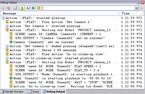
Each message is marked with a certain icon. Mainly these are:
![]() - information about the status of the played actions and other system events;
- information about the status of the played actions and other system events;
![]() - users messages from the actions;
- users messages from the actions;
![]() - errors (all in a day’s work… );
- errors (all in a day’s work… );
If the mode for outputting the script commands ![]() is turned on in the pane toolbar (off by default), you can see the executed script commands that constitute the “body” of each action played. If you have an inquisitive mind, it may be interesting to you…
is turned on in the pane toolbar (off by default), you can see the executed script commands that constitute the “body” of each action played. If you have an inquisitive mind, it may be interesting to you…
If necessary, use this information to debug your actions. If this be not enough, – output your own messages by inserting the Debug Output command in the key places of the playlists (would be difficult to overlook it when working with playlists). The parameter of this command is the text string that you insert in the Value column.
Here is an example of how you can enrich your main playlist with the debug output:
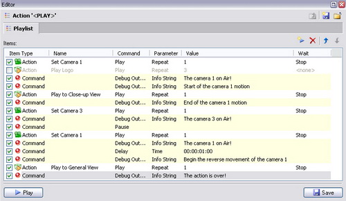
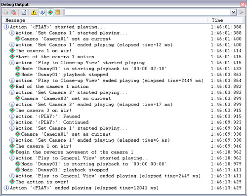
This way it is much clearer when and what occurs when playing actions isn’t it?
Working with Groups of Objects
This Chapter discusses similar manipulations with several scene objects. Suppose you have a task to hide/show the eight small screens alongside the main virtual monitor. If the screenlets had a common parent node, all would be much simpler, – we would hide/show these nodes by using only the two actions that control displaying the parent. But alas, our poor little screenlets turned out to be orphans (To be more precise, they do have a global parent, namely the «<Main>» node. However, it is the parent for the rest of the scene nodes as well, that means by hiding it, you would hide the whole scene, which is in no way your intent).
So, if not resort to additional tricks and based on your recent experience, the process of achieving your goal might look like this:
- 1. You identify the names of the eight nodes that correspond to the screenlets («Screen 01» – «Screen 08»). It ain’t too long, be a sport…
- 2. You create eight actions, each of which is responsible for hiding the corresponding screenlet (based on the standard action “Modify Node”).
- 3. You create the opposites of the hiding actions (also eight of them) that provide displaying each of the screenlets.
- 4. To hide all eight screens at once, create a playlist action as described in the previous Chapter, and add to it the eight hiding actions.
- 5. In the same way, create the second playlist, – this time to show all screens.
You see, to hide or show the eight screenlets at once, you have to create as many as 8*2 + 2 = 18 (eighteeeeen) actions! Quite a tiresome job, between ourselves… Therewith, it turns out that you will have to hide/show still a ninth object – the common frame of these screenlets (“Screen Mount”), and to do so, you will have to create still a couple of actions and add them to the playlists. Altogether 20 actions plus a savage irritation from the monotonous job. But you are going to act in a much more effective way.
You may solve problems like this by creating homogeneous object groups, which allows you to apply commands of a certain action to several objects at once.
Creating Groups of Scene Nodes
So, create a group of the scene screenlets. To do so, activate the scene document and open the tree of all available nodes. It is recommended that you turn off the “Show Owned Items” mode to easier select a group of nodes. Select the nodes from “screen_01” to “screen_08” using the <Ctrl> and <Shift> keys exactly the same way as in any Windows explorer.
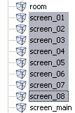
Now drag the selected nodes to a free area in the project tree window. A “Nodes” group is automatically created in the “Media” folder of the project, and its elements are displayed in the right of the window.
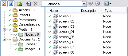
Note that the icons of the group objects are tagged shortcuts, – that means you actually added to the group the links to the nodes. These links may be easily deleted or renamed, the original objects being none the worse for it.
So, you have just created the root group for nodes. If you are planning to work with different subtypes of this group of nodes in advance, you can create a new subgroup using the context menu of the group. You should click the New Group… command and drag’n’drop nodes to this specific subgroup. In this example we call the group Screens.
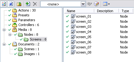
Groups are renamed in the same way as other objects: using the context menu, by pressing the F2 key, or in the properties pane.
Now, create a new action based on the standard action “Modify Node”, only this time on the first page of the wizard dialog box, select not a single node, but the created node group “Screens”.
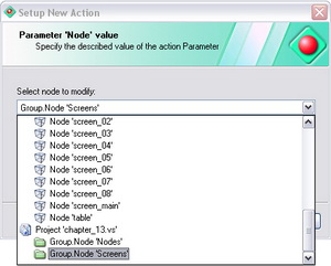
Name the action as «Hide Screens», and do not forget the “Hide” parameter in its properties. Play the action, – there you are, the goal is achieved with minimal means: all eight screens disappear at a blow!
It only remains to create the opposite action “Show Screens” and play it to restore the hidden nodes.
We have not added the “screen frames” nodes to the group, and this is for a purpose: to emphasize the advantage of the groups by giving this example. So, do it now, – drag the “frame_left” node and the “frame_right” node from the scene window to the group (if the group is open, you can drag directly to the list of group objects). Without changing anything in the “Hide Screens” action, play it and make sure the frame has disappeared along with the screenlets. Now play the show action, – the frame appears along with the “group mates”. Which was to be proved!
It is easy to guess now that if you remove any nodes from your group, playing the actions will not affect them now. If you do not believe this, check this! Just in case, note: to delete nodes from a group, open it in the project tree (left), then select the required elements in the list of the group nodes (right), and then execute the delete command.
But if you are going to use several node groups, better create subgroups within the root group “Nodes” by using its context menu command New Group… and drag nodes directly to them.
One and the same object can be included in several groups simultaneously, which extends the ways in which you can use grouping.
When adding one and the same object to different groups, the shortcut name is added with a number so that there are no shortcuts with the same names.
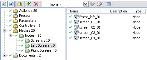
Objects can be dragged from one group to another. To do so, open the “source” group in the project (from where you want to take objects) and select the required objects in its list. Then drag them to the “receptor” group in the tree, place the mouse pointer where you want them (a minus sign is added to the mouse pointer), and drop them there.
If a red “stop” sign is added to the mouse pointer when hovering over a group, then you cannot move objects to this group. Possible reasons: this as a group of objects of another type, or this is the very group from where you are moving the objects.
If you want not to move but create a copy of the “source”-group objects, hold the <Ctrl> key while dragging (a plus sign is added to the mouse pointer). To change group structures, you can also use the clipboard: the Cut or Copy commands, then – Paste when in the required group.
Groups of Other Types
Groups can be used in this application not only in actions, but also to sort out the numerous objects in the project. It is especially critical for action objects since their number may well exceed one hundred.
To create and change action groups, use the context menu of the root folder (or of the created group) in the project tree. You can easily figure out the menu commands on your own. Drag actions from one group to another by using the method described above or the clipboard commands Cut and Paste.
When the Expanded Groups mode for displaying the list of objects is on, you can see not only the elements of the open group, but also the elements of its all subgroups.
And if the Group Titles mode be on, the list displays in bold all first-level subgroups.
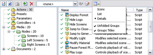
In theory, you can group any object types. However if you use groups as action parameters, you should note:
Not all actions support selecting object groups, and even when do support, – under certain conditions this may lead to an unexpected result.
To keep your head after this statement, examine the standard action types in which you can safely use groups.
Standard Actions That Support Groups
Let us specify which useful operations with groups can be performed by the following standard actions:
Modify Node. Sets the same visibility for the group nodes, and if necessary – the same transformation.
When applying transformation to a group of nodes (position, rotation, scale), the coordinate axes of the nodes must be equally directed, otherwise the objects will “scatter” in different directions after the action execution.
If you remember we have delayed the logotypes animation to better times? So, here we go.
In the “Nodes” folder we create the “Logo” subfolder and using the scene tree drag’n’dropping nodes “logo01”, “logo02” and “logo03” to our newly created subfolder.
Basing on the standard «Change Node» action we create the «Logo Animation Rule» action. In its properties we select the “Group.Node.’Logo’” value for the “Node” parameter and “Not played by parent node” for the “Animation” parameter.
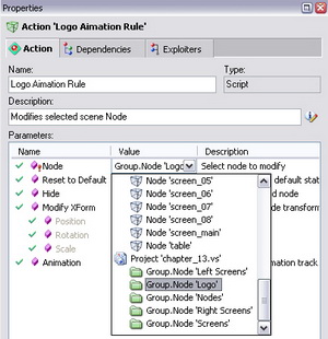
We place the action to the «STARTUP» and make sure that zoom-in and zoom-out of the moving camera do not cause logotypes rolling.
Control Node. Allows you to execute playback commands with identical parameters (start/end frame, speed, etc). It is useful when the played nodes do not have a common parent (as is the case with the screenlets).
Basing on the standard “Control Node” action we create the “Play Logo” action. In its properties, select the “Group.Node.’Logo’” value for the “Node” parameter as before. We set the initial and final time of playing and set the “Yes” value for the “Loop” parameter.
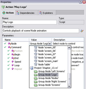
We place the action to the “STARTUP” and, serially switching virtual cameras, we make sure that the logotype is rotating simultaneously.
Modify Material. Applies identical properties to all material included in the group. But be careful when using this.
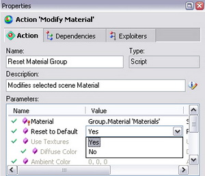
If you want to restore the original properties for the group members, set the “Yes” value for the “Default” parameter in this action properties and play it.
Modify Light. Applies identical properties to all light sources included in the group. If you want to restore the original properties, do the same as for materials (see above).
Morph Mesh. In this mesh, you may select a group as a source mesh. When morphing all meshes of the group will acquire the form of the final mesh. To restore the original form, use the global reset-all command.
However you can be assured: in spite of some limitations, using groups is quite a powerful tool for the scene control optimization!
Improving Scene Control Ergonomics
In this Chapter you will continue the process of improving the scene control ergonomics. But whereas previously you worked mainly with hotbar properties, this time you are going to come to closer grips with the properties of individual buttons. And you are going to start with the most spectacular part, – assigning scene snapshots to buttons.
Assigning Scene Snapshots to Buttons
Scene Snapshot refers to its current image in the Render Preview window saved in a.BMP (Bitmap Picture) file.
As a rule, scene snapshots are used on camera-switching or -zooming buttons. And no wonder: in such cases it is very useful to see a visual thumbnail of the final view (which is much more informative than a signature or a noncommittal icon). Hightime you breathed life into the buttons of the “Mobile camera” hotbar.
The assignment procedure is quite simple. It is performed in the hotset edit mode.
Start with the “Close Up (set position)” button. To take an adequate scene snapshot from active camera 1, first execute the action of switching to the camera. To do so, click the appropriate button. Sure you may jump to the test mode and back every time you need to do so, but there is a simpler way.
You can play the action assigned to a button in the hotset edit mode as well: to do so, execute the Play Acton command from the button context menu or simply double-click on the button.
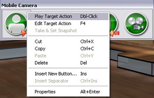
Double-click on the button and execute the action. If nothing has changed in the scene window, – then camera 1 was already active and in the required point. Now, select the Take & Set Snapshot command in the button context menu.
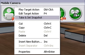
The standard save-file dialog box opens prompting you to save the new snapshot of the scene in the project folder. It is easy to notice that the screenshot prompt name is identical to the button name. If you want, you can safely change the snapshot name: it won’t affect the button name and the beauty of the button.
You can save the snapshots in the project folder (and wheresoever), but for purposes of good order, better create a dedicated subfolder, e.g. Snapshots (or Shots).
So, using the dialog, create a Shots folder and save the snapshot file to it, leaving the default name “Close Up (set position)”.
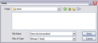
When the dialog box is closed, the thumbnail of the current scene image immediately appears on the button. However, the thumbnail is kinda… too midget…. And then, it’s square too, whereas the scene aspect ratio is 4:3 (if use SD mode).
Inference leaps to the eye: It is necessary to change the aspect ratio from square to Standard (4:3) in the hotbar properties and to increase the button size to at least 96 pixels in width.
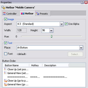
The hotbar changes its size, and the snapshot on the button becomes quite visible:

According to the technique described above, assign snapshots to other hotbar buttons, each time playing the respective action before assigning the snapshot to a button.

Switch the hotset to the test mode or switch the application to the global live mode to enjoy your «pumped-up» hotbar to the full! The final effect of pressing the camera-operation buttons will now be immediately obvious to the most casual passer-by.
But never stop at what has been accomplished: continue improving the ergonomics of your buttons by assigning to them some most “hot” keys...
Hotkeys
Hope you have the right idea of hotkeys, whose purpose is not to warm your fingers on the keyboard on cold winter evenings if anything.
Hotkeys assigned to buttons allow you to use the keyboard key combinations in addition to mouse button clicks, which is most practical for regular project users. Hotkeys are available in live mode or in the hotset test mode only.
Only one hotkey can be assigned to a button.
Why not assign a couple of hotkeys to virtual-camera operations? Let pressing <1> or <2> on the keyboard activates the camera with the respective number.
Here goes. Open the “Close Up (set position)” properties and select the Hotkey tab.
All you need to do is to click in the entry field on the left of the Assign button and press the desired “hot” combination. In this case, it is the digit “1”. So, press “one” on the keyboard, and then click on the Assign button in the properties pane. The properties immediately change their appearance displaying <1> as the current hotkey for the “Camera 01 Start” button.

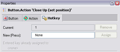
In the same way, open the “General View (set position)” button properties. But do not rush to press <2>: you are going to do some small experiments. Say, what happens if you try to assign a system key combination like <Ctrl+S> used to save changes? Try it: press the key combination and make sure the application just disallows you to assign it and provides the notice below.
An analogous notice appears if you try to assign the already used key <1>. So carefully read this information when performing new assignment operations.
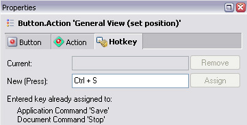
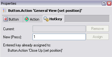
But if you still want to use a hotkey already assigned to another button for all that, – first cancel the key in the properties of the host button by clicking on the Remove button in the hotkey tab.
Now, that you figured out the pitfalls of the hotkeys, assign key <2> (and so on) to other hotbar buttons. Just to be on the safe side, open the “Cameras” hotbar properties and make sure all hotkeys are displayed in the Hotkey column.
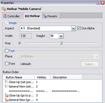
Now you can test the improved camera-operation system. Switch to the hotset test mode (or live mode) and hit the numeric keys one after another (as fast as your touch-typing fingers allow). As you can see, operating cameras from the keyboard can be most effective!
Radio Button Groups
What else could be done to improve the “Mobile Camera” hotbar? Now that all those snapshots and hotkeys have been assigned… There is still plenty of room for improvement!
Suppose, how can you tell which of the cameras is active by the look of the camera-operation buttons? You know, after you clicked a button, it is immediately released. The best bet would be to join the camera-operation buttons in a radio group.
Radio Group joins several buttons in a commutated system. When a button is clicked, the rest of the group are released. The clicked button remains “jammed” in the pressed position until another button is clicked. You cannot click a button again while it is pressed (the assigned action will not be executed again). The buttons are clicked and behave the same way when using the dedicated hotkeys.
Buttons can be joined in a radio group in their properties. Open the “Close Up (set position)” button properties and examine the Radio Group combo box. It is empty so far since you have no radio group. Go ahead and create one!
Enter the name of the new group in the entry field of the combo box, e.g. “Camera 1” and click the Apply button. By doing so, you have not only created a new radio group but also made the “Close Up (set position)” button its first member.
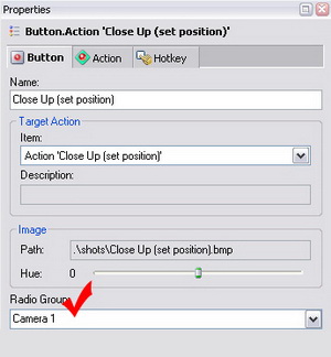
Now add the next button to the newly created radio group. It is still easier: open its properties and simply select the “Camera 1” item that appeared in the radio-group combo box.
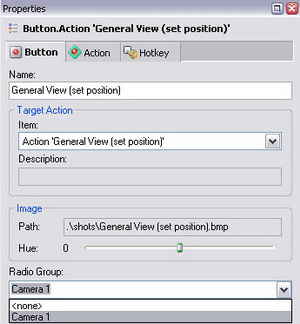
In the same manner, add the remaining buttons from the “Mobile Camera” hotbar to this radio group, – it will do you good! While you are about it, a couple of notes for future reference:
To remove a button from a radio group, select <non> in the Radio Group combo box in its properties or simply delete its name from the current group.
There may be many radio groups, but a button can be included only in one of them.
Switch the hotset to the test mode and test its availability. Once you click a certain camera-operation button, it remains in the pressed position thus indicating the active virtual camera.

If you want a required button from a radio group to become pressed right after the project initialization, add the corresponding camera-activation action to the project startup action. Otherwise, the application just will not know which button should be pressed by default.
By the way, if you add action “Camera 01 Start” to the project Startup, so the “Camera 01 Start” button will be auto-pressed right after the execution of the system command Start All.
Disabling Buttons
One is not required to be clairvoyant to guess that when testing ready-made projects, you clicked the hotset buttons in a haphazard way, which caused as chaotic scene behavior. A typical situation: before the camera had time to fly to the close-up, you gave it “backward motion” or switched to another camera. In terms of free experiments, there is no harm in it, but during live broadcast one wrong click on the button can lead to an awkward situation… Is there a way to minimize the harm or to prompt the operator not to hurry to click other buttons and just wait a little?
There is the ability to disable the other buttons for any button in the hotbar. The other buttons are disabled while the action of the current button is played (a green triangle is always lit up in the upper left corner of the button when playing, – do not confuse it with the indefinitely pressed position of a button included in a radio group).
So, where within this tutorial project could buttons be disabled? Why not on the “Close Up (go to position)” and “General View (go to position)” buttons for the operator not to rush to hit the other buttons and wait for the end of the zoom-in or zoom-out?
No sooner said than done! And it’s done in the button properties again…
Open the “Close Up (go to position)” button properties and examine the tree list While pressed disable buttons. In this list, check the check boxes of the buttons whose clicking are to be disabled when zooming in: “Close Up (set position)”, “General View (go to position)”, and “General View (set position)”.
In the same manner, disable the “Close Up (go to position)”, “Close Up (set position)”, and “General View (set position)” buttons in the properties of the “General View (go to position)”.
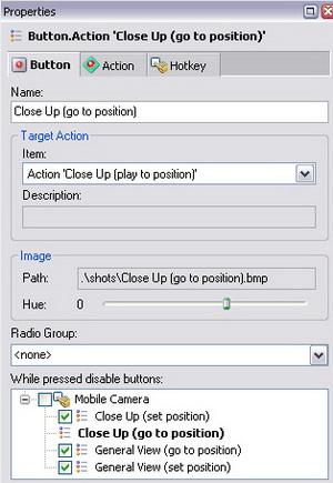
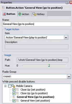
To test what you have done so far, click “Close Up (go to position)”. Camera starts moving, the button being in the pressed position, – and look: the above mentioned buttons have become grayed out, with the disabling icon in the upper left corner for indication. However hard you may try now, until the camera has flown all the way to the bitter end, you cannot click the buttons, even though by using the hotkeys. (Even the greatest effort of your unbending will fails to click them, to say nothing of those hotkeys…). The same refers to playing “General View (go to position)”.

Note that buttons in other hotbars can be disabled as well.
If you want to disable all buttons in a hotbar, check the checkbox next to the hotbar name in the disable-buttons list, in which case all its buttons are automatically disabled.
To consolidate the knowledge, you can disable some other buttons. Come on, sometimes a little disabling can prevent a huge disarrangement!.
* Multipage Hotsets
This Chapter discusses advanced arrangement techniques for projects with a great number of hotbars. If the only one hotset window in the foreseeable future suits you fine, you can safely skip this subject.
So, you could have encountered multipage hotsets when getting acquainted with ready-made projects.
Multipage hotsets are useful when it presents difficulty to place all hotbars in one window. Or when you can split the scene control into distinct and nonoverlapping groups (e.g. different parts of one scene or parts of one show separated in time).
The hierarchy of the hotset pages completely mirrors the hierarchy of groups in the “Controllers” folder of the project. So, the number of the nested levels of the pages can be as large as of the groups.

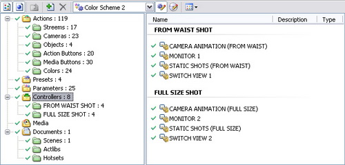
Hence Method One for creating and modifying pages:
Create, modify, and delete groups in the “Controllers” folder the same way you did this in the “Actions” folder or other media folders of the project. The methods of moving from one group to another remain valid here. Note that when deleting a group (page), all its objects including the nested groups with their own objects are deleted.
Method Two: use the hotset context menu opened by right-clicking on its free space and context menus of individual pages opened by right-clicking on the corresponding title bars (tab grippers). The latter method is discussed below.
So, once you proceed to arranging hotset pages, create a first subpage to be going on with. To do so, select the New SubPage… option in the hotset context menu.
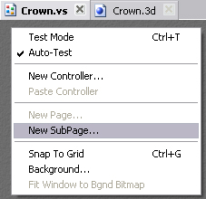
After that, you will see as many as two tab grippers: the latter corresponds to the new empty subpage whereas the former – to the main page of the current level. The main page is the parent of its subpages. Currently it contains all previously created controllers of the hotset.
To create the next subpage, now there are already two methods:
1. Return to the main page and select the New SubPage… option again.
2. Select the New Page… option in the context menu of the current subpage. By doing so, you create a sibling page, that is on the same level and with the same parent (main page).
As it was mentioned above, you can open the context menu on the newly created pages by right-clicking on the title bar (tab gripper).
By using the context menu options, you can rename or delete the current page, add new sibling pages and child pages, and also enable its own separate window when in Live Mode.
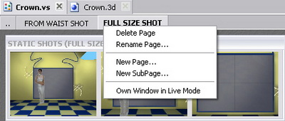
If the Own Window in Live Mode option is on, the page is displayed as a separate window when switching to the Live Mode. If the separated page has its subpages, they will be displayed in the separate window along with it.
In Live Mode only:
- by clicking on the close button (X) in the title bar of such a separate window, you can join it to the main (for the current level) page tab as a subtab;
- by dragging the joined subtab by its title bar (tab gripper) and dropping it on a free area in the Main Window, you can make it independent (when switching back to the Edit mode, the Own Window in Live Mode option will be on).
When you have created the desired hierarchy of pages, you can move the existing controllers from the main page or create new ones. Note here:
You can move controllers from one page to another by dragging them in the project window or by using the Cut command from the controller context menu (opened by right-clicking on its title bar) and the Paste Controller command from the hotset context menu (opened by right-clicking on the free space).
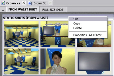
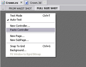
Maybe in abstract theory, the concept of all these pages-subpages looks too complex, but a little practice will put everything into place. Because you see, the interrelation of these pages and controllers looks very much like the hierarchy of the files and folders in the operation system. That means the whole thing is as simple as Windows 7!
Epilogue
Here our cognitive journey over the most popular points in creating simple projects in HotActions 3.0 is “set to pause”. For a wide range of applications, the experience gained is quite enough (at least, to be going on with). Now you need to practice a little on your own and have some “free-flight” experiments. Perhaps it is worthwhile to refer to the User’s Guide to clarify obscure points in the interface.
But if you want more, there are great prospects for further progress! Because some mighty techniques in HotActions 3.0 are looking forward to being applied by you. These are:
- creating and using global parameters, binding local action parameters to them;
- using presets within the project;
- other controller types: joystick, node transformer, track player, global/local parameter controllers;
- overlay mode to improve the quality of the camera’s video;
- alternative signal sources, including network video;
- various functional plug-ins;
- and so on and on;
…and finally the Summit of all HA techniques:
- programming parametric actions in script;
- creating local action parameters of your own and their interaction rules.
When you reach the final steps, you can call yourself a True Expert of HotActions 3.0 by right! Congratulations in advance…
Good luck!
Yours sincerely,
Ruslan Velikokhatny

